(2022)
Directed by: Sean Sevestre
Produced by: Kojos Trick Lab, Sean Sevestre & Project Gravity
_________
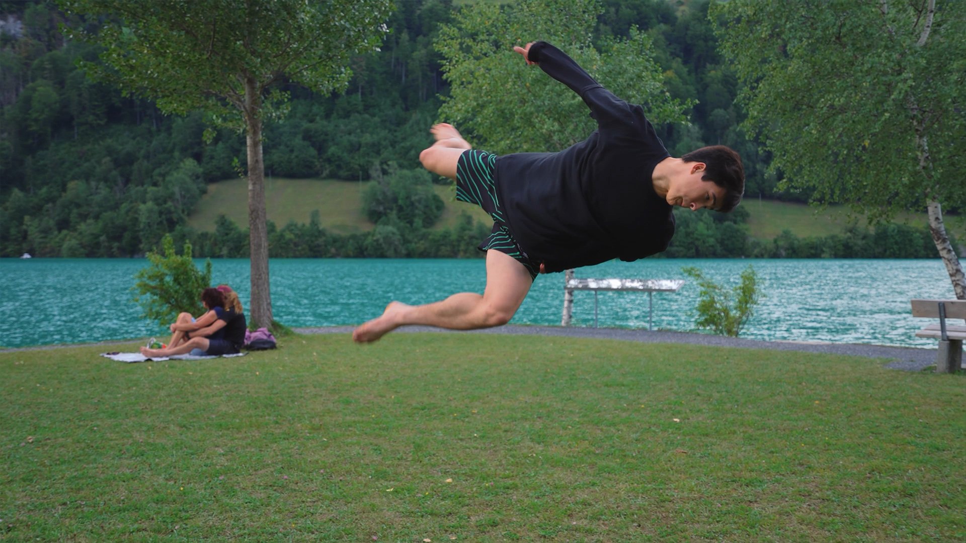
Tiki Wu is one of the best Trickers in the world.
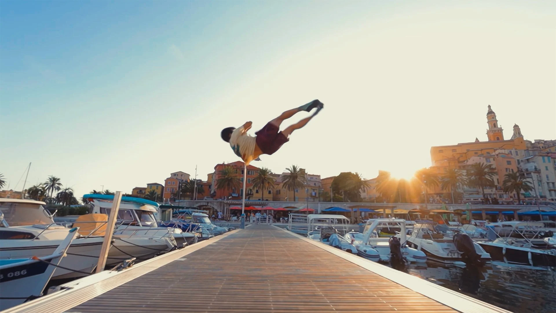
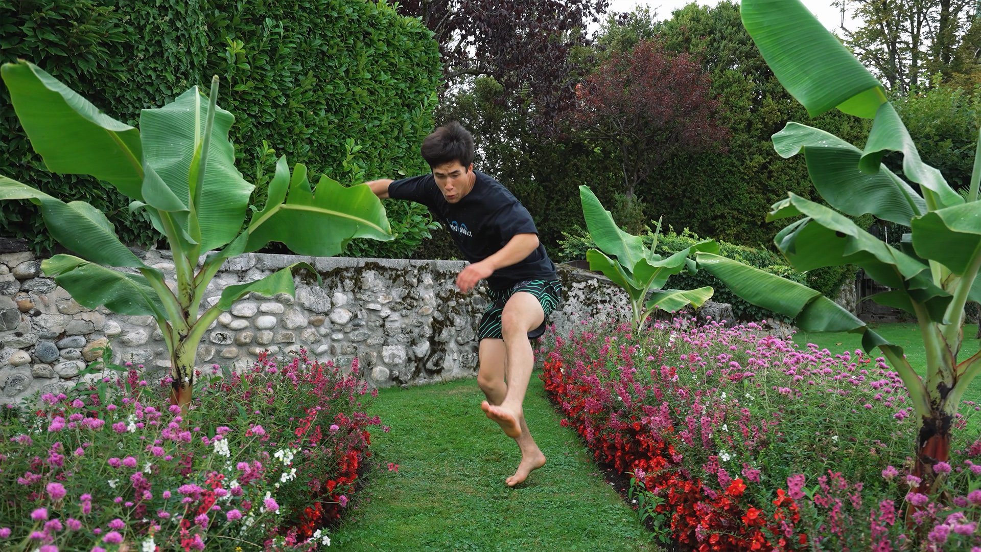
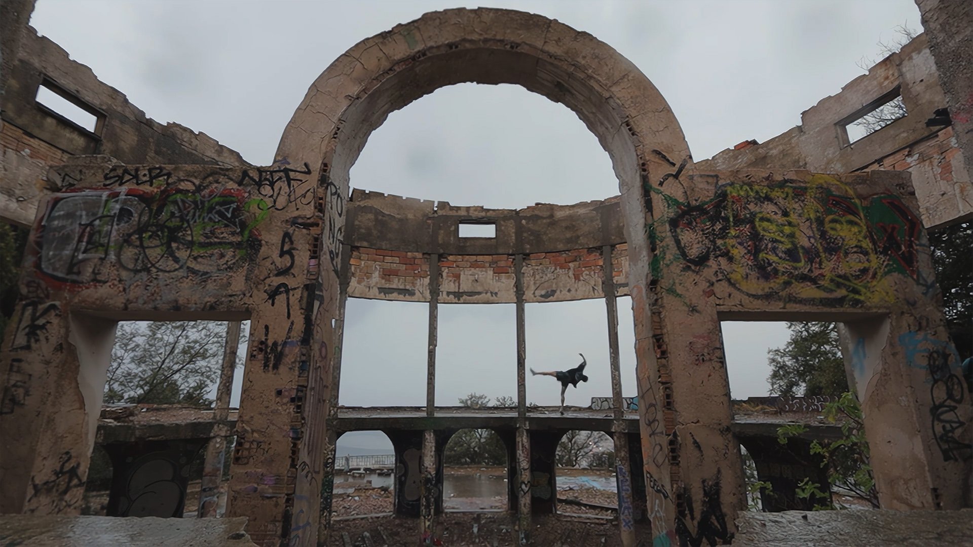
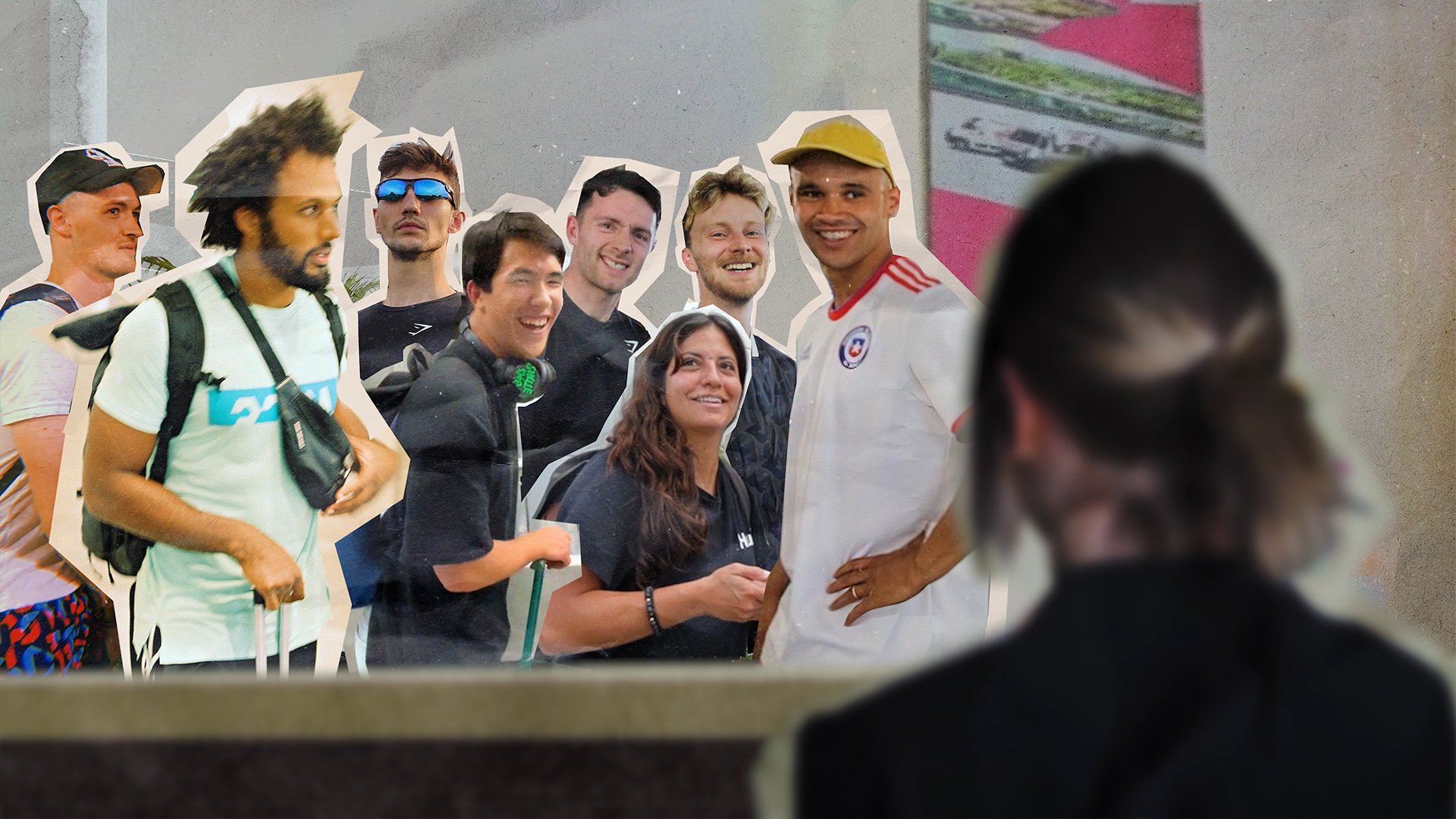
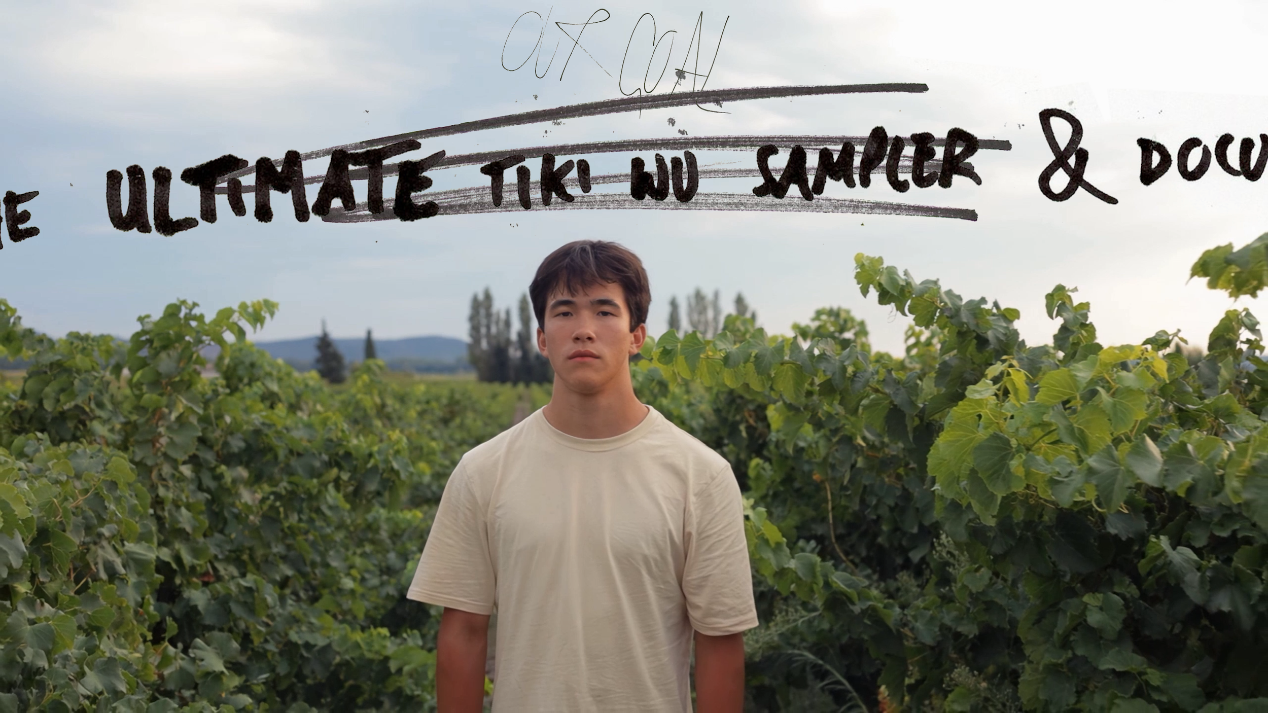
Join Tiki and a team of veteran Trickers on a chaotic road trip across Europe as they battle the elements and their physical limits in an attempt to create the ultimate Tiki Wu sampler.
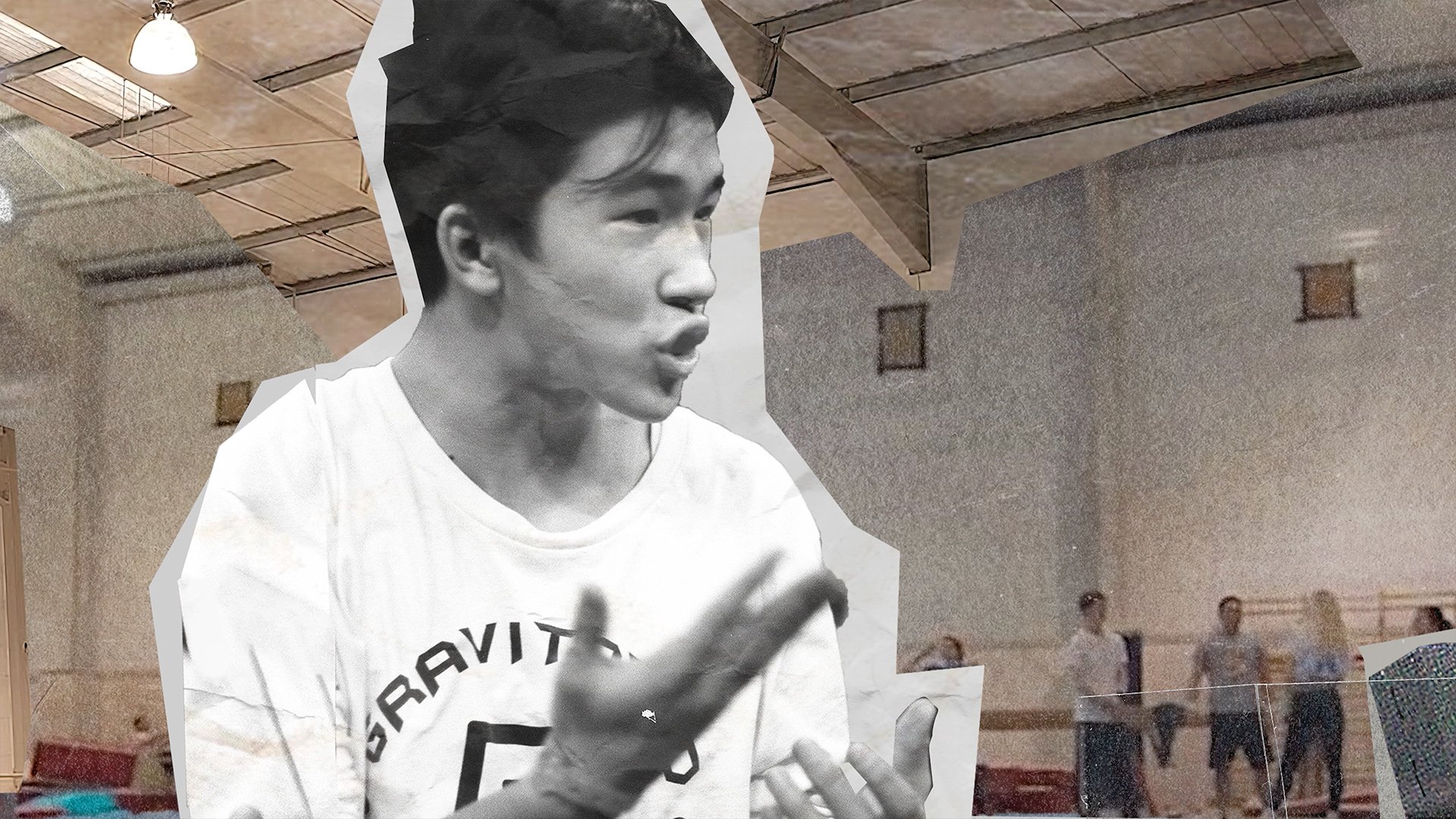
The film explores the journey that has lead Tiki to elite levels of performance and what drives him. As well as the importance of adventure and film making.
There are twists, turns, good mates, comedy gold and world class flips. What more could you want.
This is my second feature length documentary on the sport of Tricking. I directed, edited and co-produced this project as well as filming a lot of the footage.
I’m incredibly proud of what the small dedicated team and myself produced and I hope you’ll come along for the ride.
Check out the trailer and if you’re interested please rent or purchase a copy, all profits go directly to Kojo’s Trick Lab who do incredible work for the Tricking community.
Authenticity in Chaos
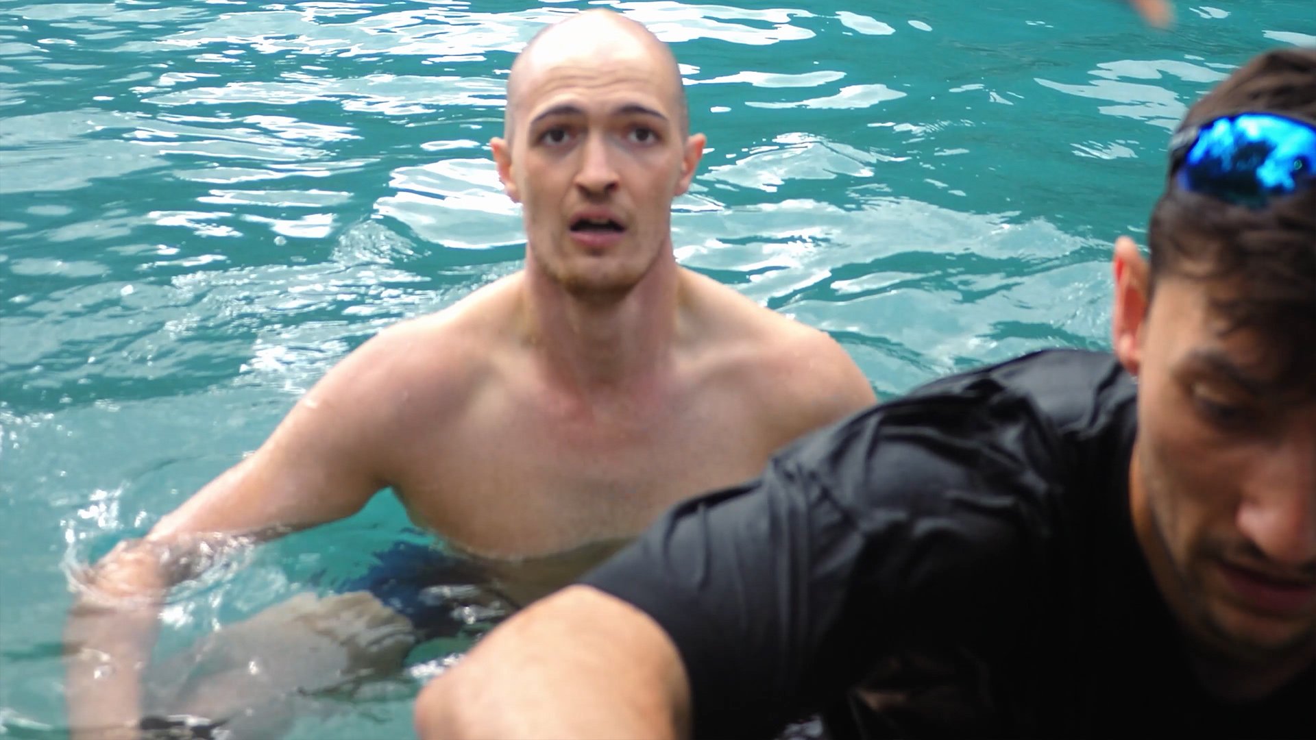
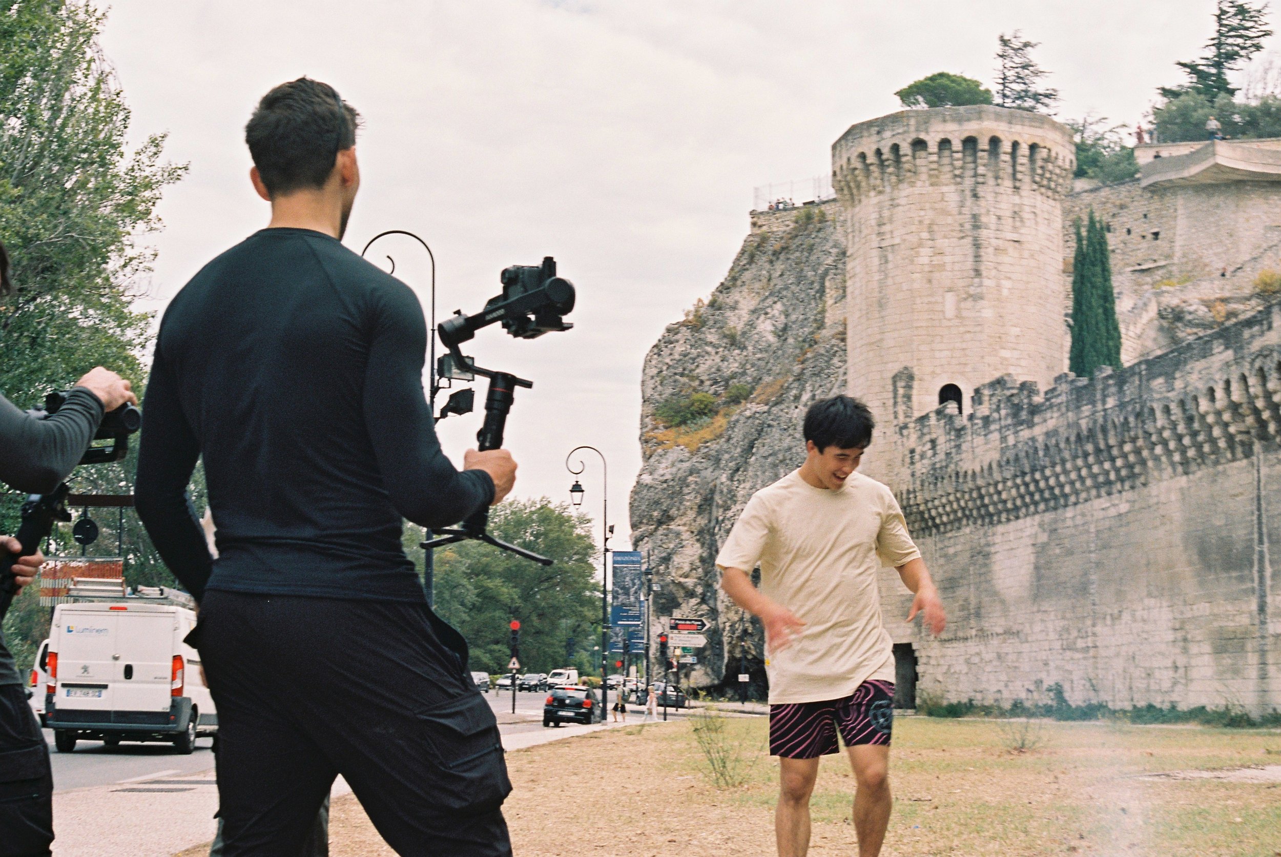
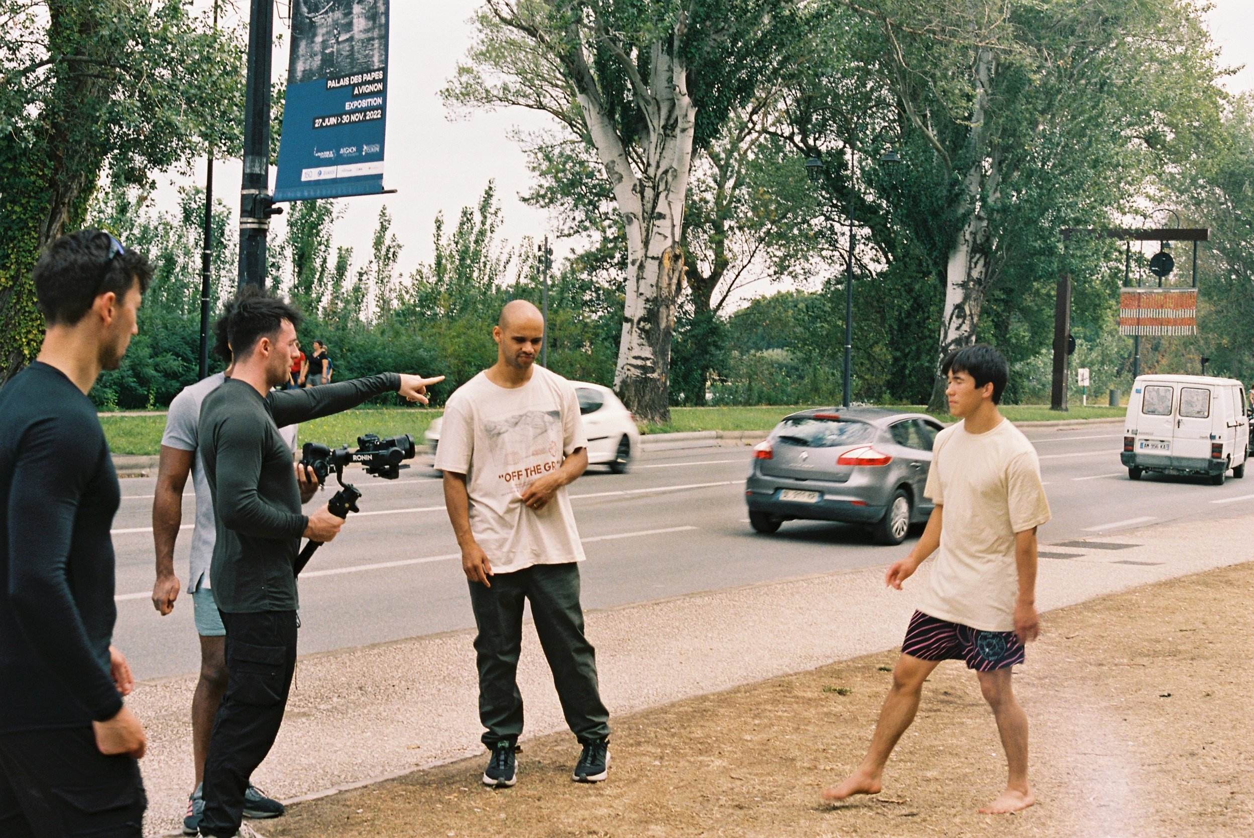
This road trip follows a group of veteran Trickers and film makers over a week as we travel through Italy, France, Germany and Switzerland searching for the most beautiful spots to showcase Tiki Wu’s incredible abilities. Of course are plans quickly fall into chaos and we’re left with no option but to improvise and roll with the punches on a daily basis.
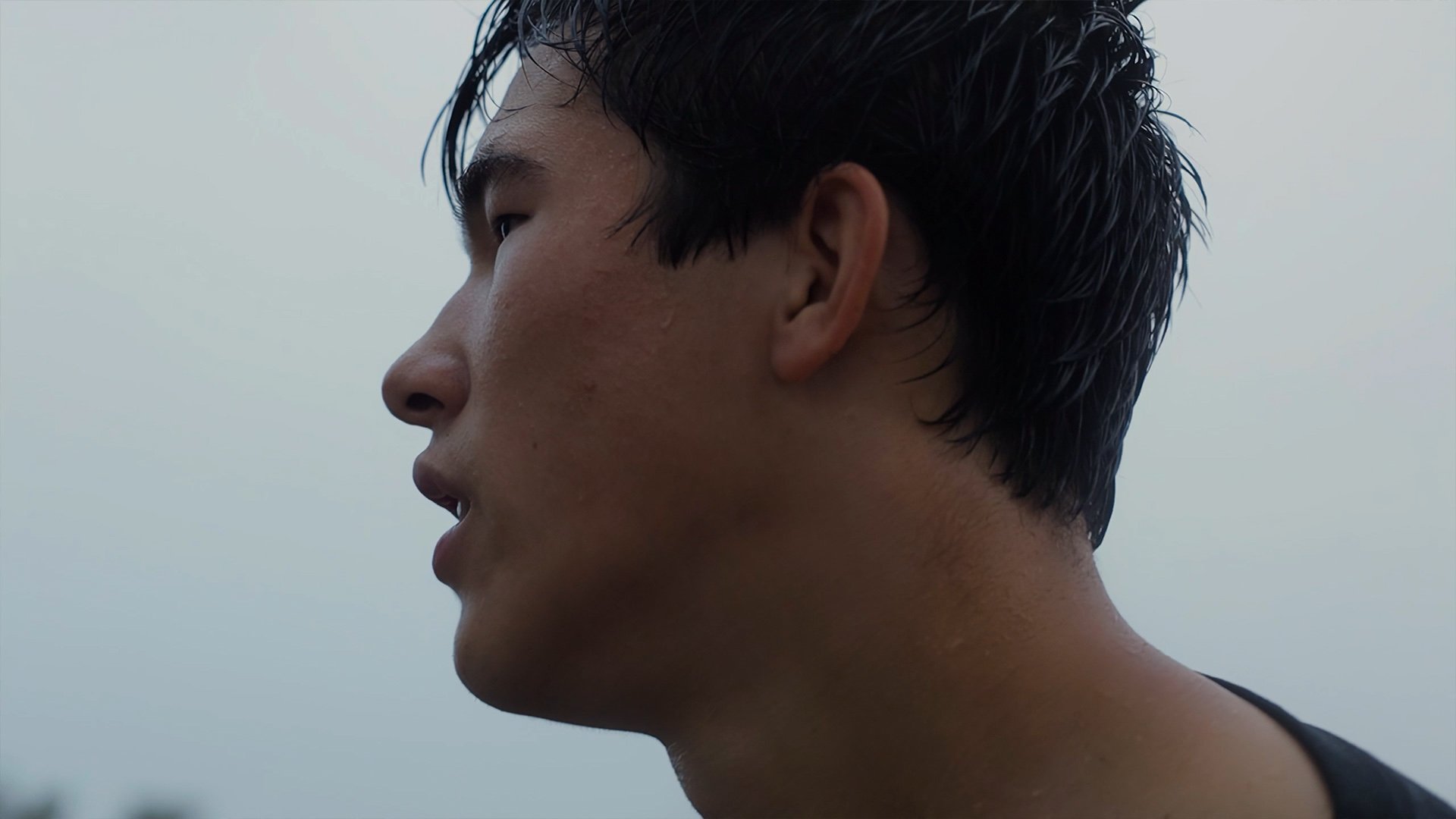
This very immediate and challenging environment is the perfect way to reveal Tiki's true character and mentality. This alongside with more traditional interview segment helps paint a wholistic picture of Tiki.
Aesthetic Worlds
I wanted this production to be large and cinematic. We we're lucky to have visually and emotionally striking events transpire during the trip but I knew that I'd be using everything at my disposal in the edit to bring impact, character, cohesion, scale, story, comedy and whatever else to the project. I wanted everything i'd learned in the five years since my last feature to come together to make this project as big, distinct and surprising as possible. Which I would achieve through drawing, painting, collage, animation, 3d, photography and photogrammetry.
Paper Collage
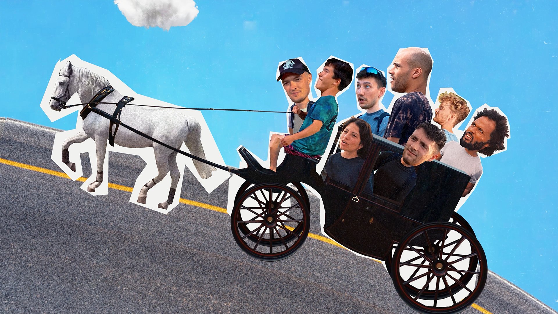
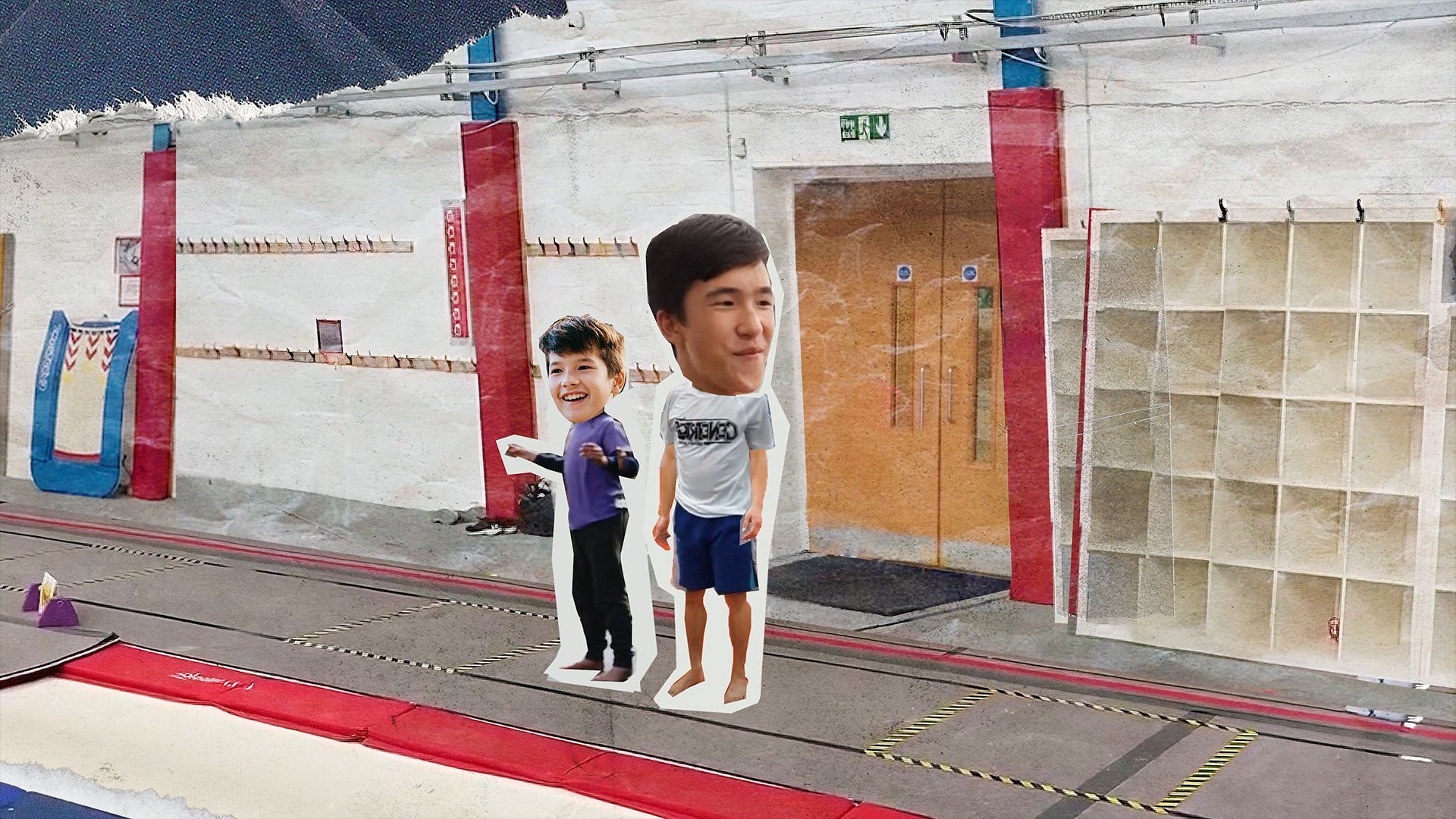
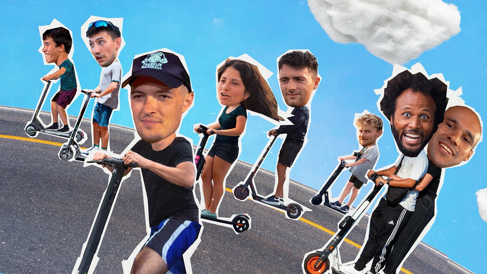
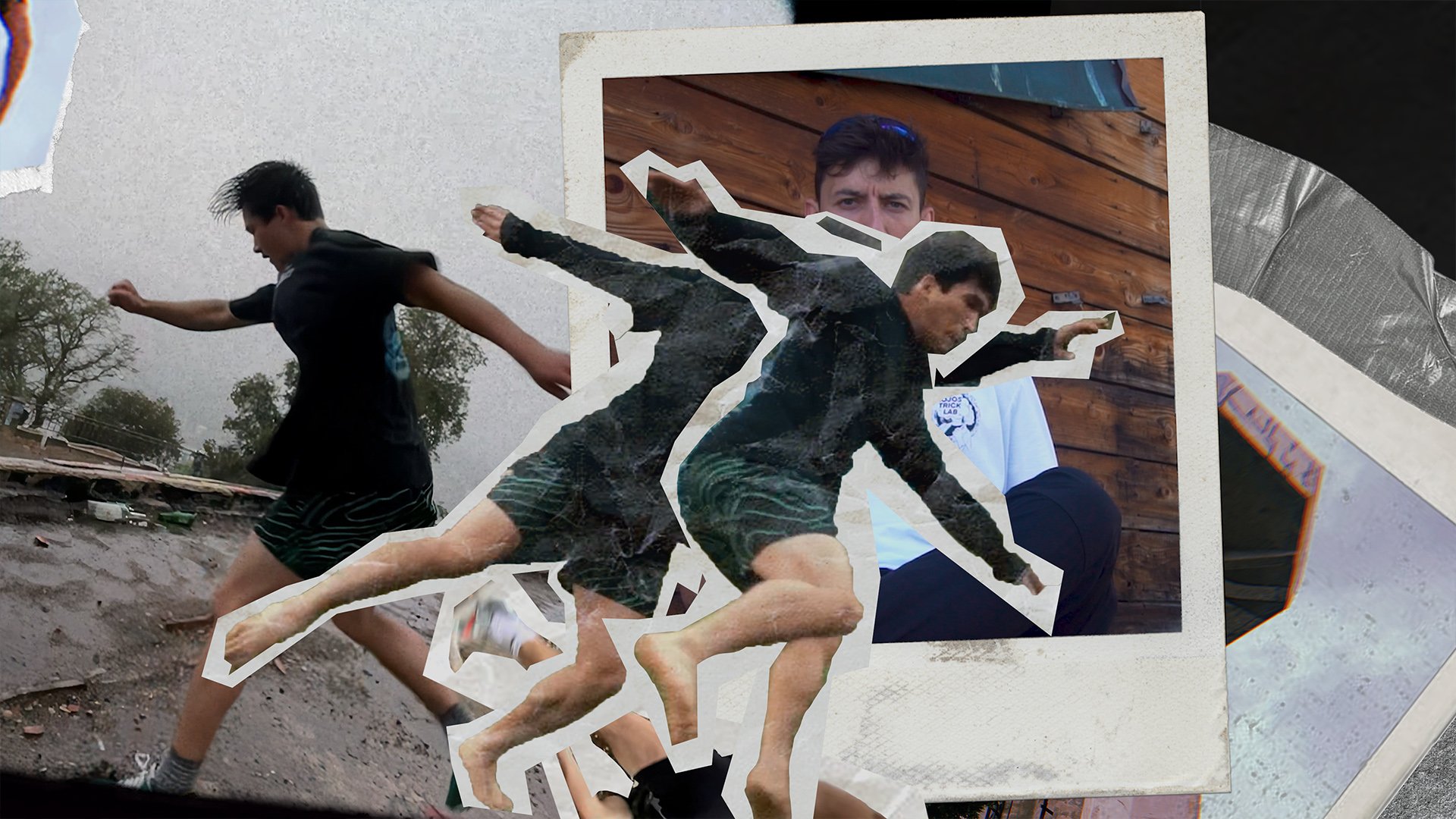
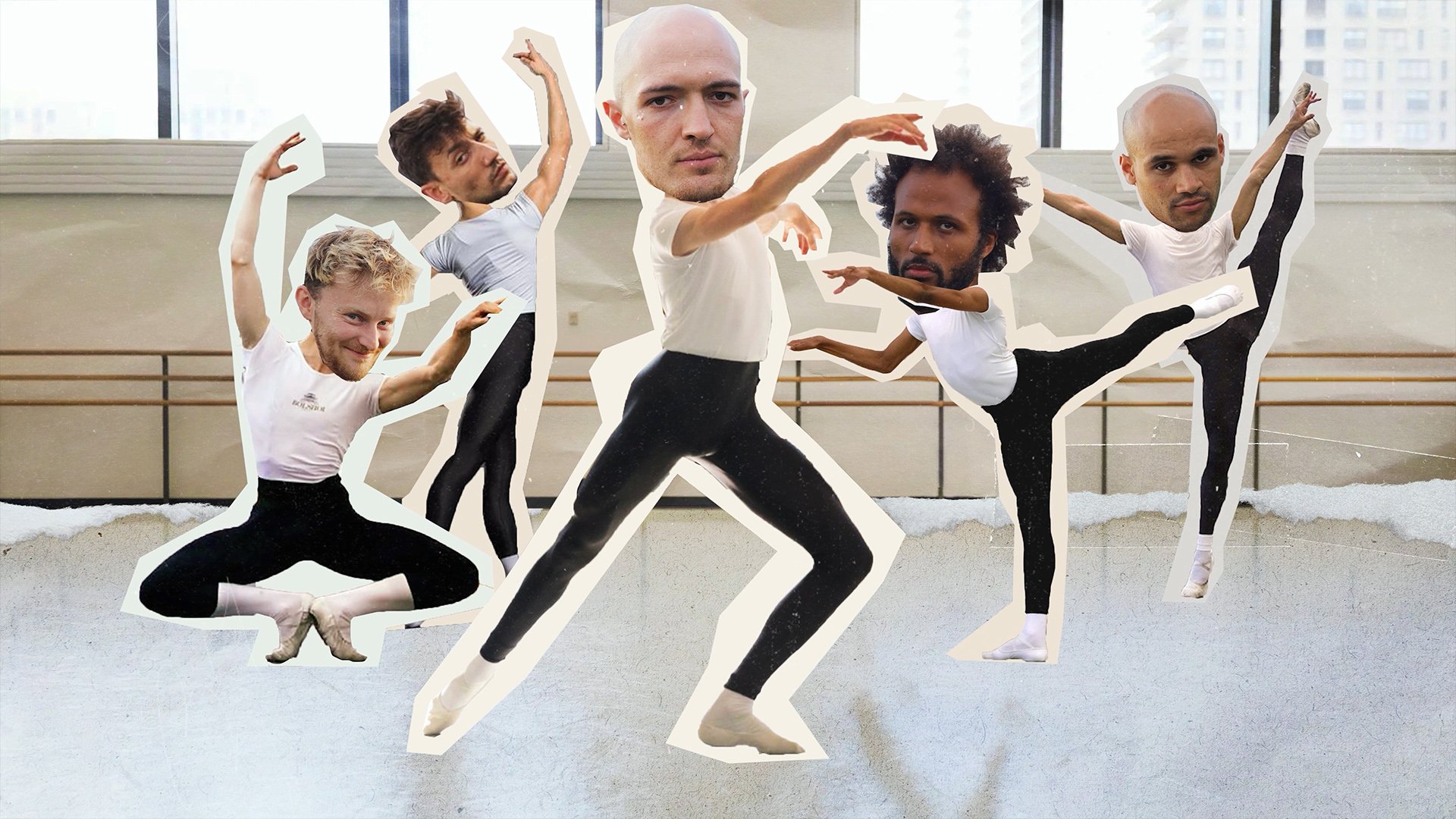
On a large project I like to make the trailer first as a way to explore aesthetics visually, sonically and tonally on a smaller scale. I knew I had to create a style that was playful and textured as it had to match the rough and fun atmosphere of the trip. After some successful experiments with a hand made photo collagey style I knew this would be the direction to weave throughout the film. The animations also have a stepped frame aesthetic to give it a crudeness/chunkiness that I liked.
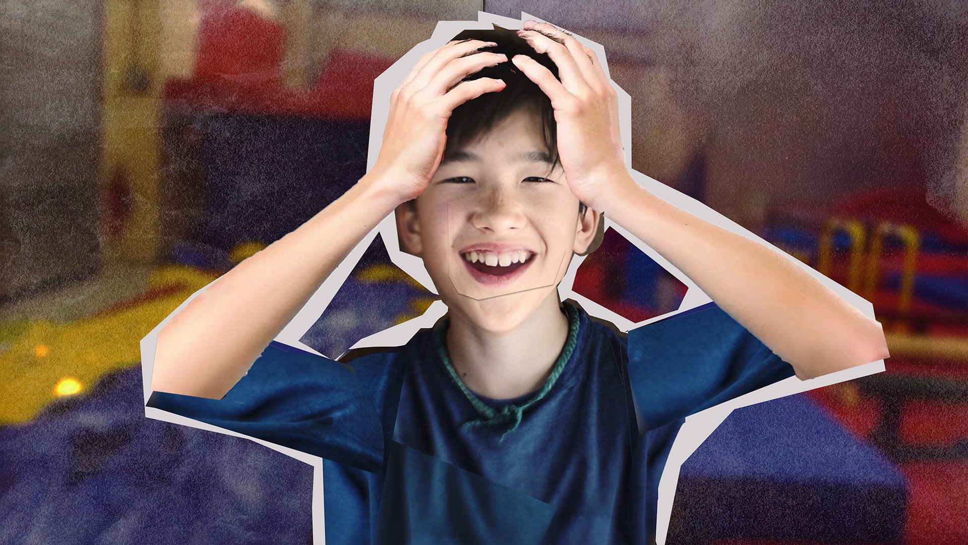
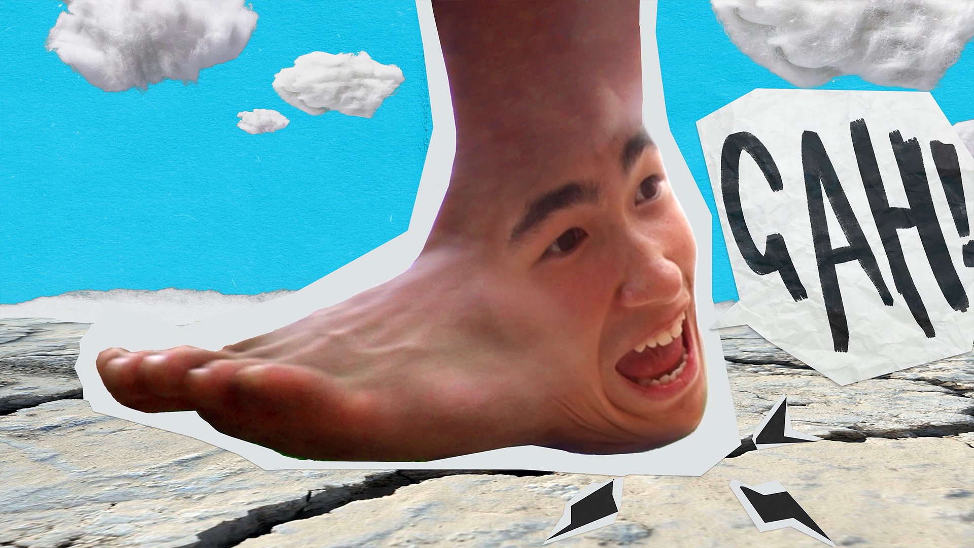
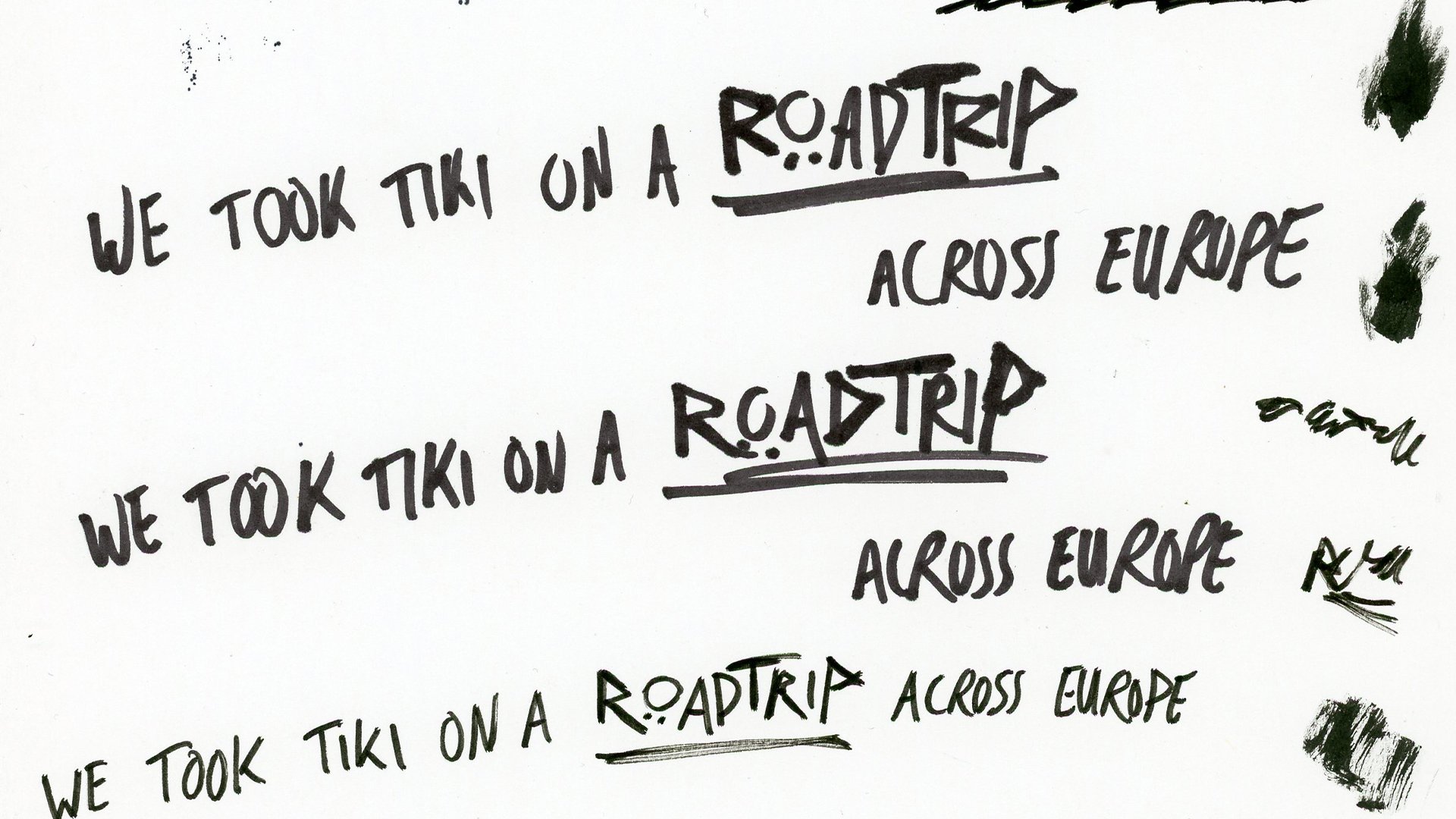
This style was used mainly to bring to life stories of Tiki’s life and journey into Tricking which we discover in pieces as the trip develops, this also helps expand the scale of the production as we now visually experience all of these additional places and moments in time throughout Tiki’s history. I also used it to bring to life jokes that were being made on the trip. I created the photo collage visuals with a mixture of photoshop, printing and scanning frames and hand drawn text.
35mm Film
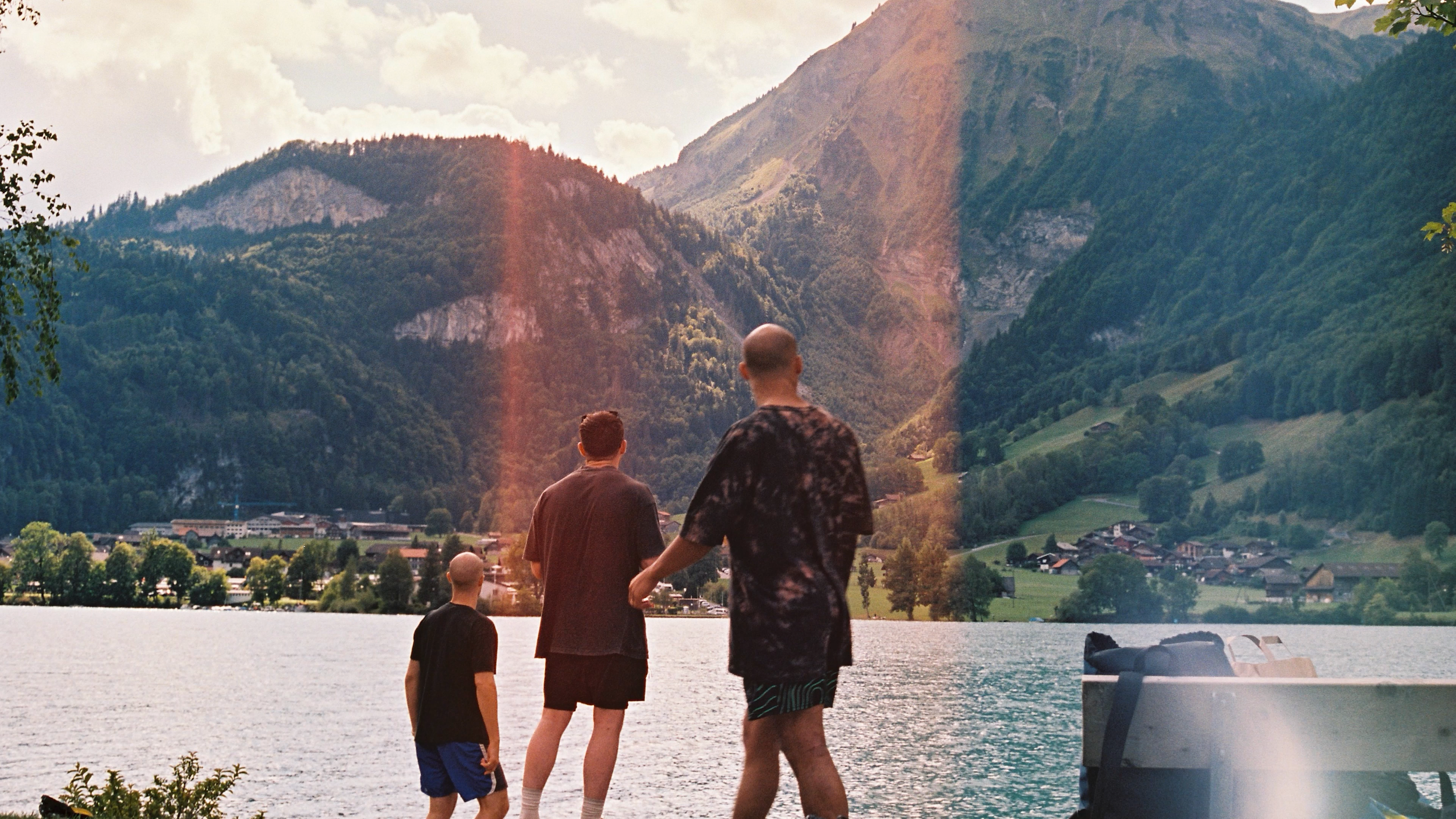
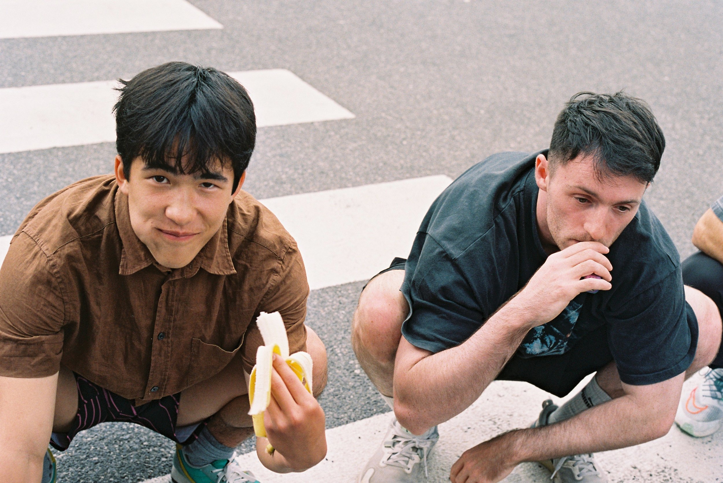
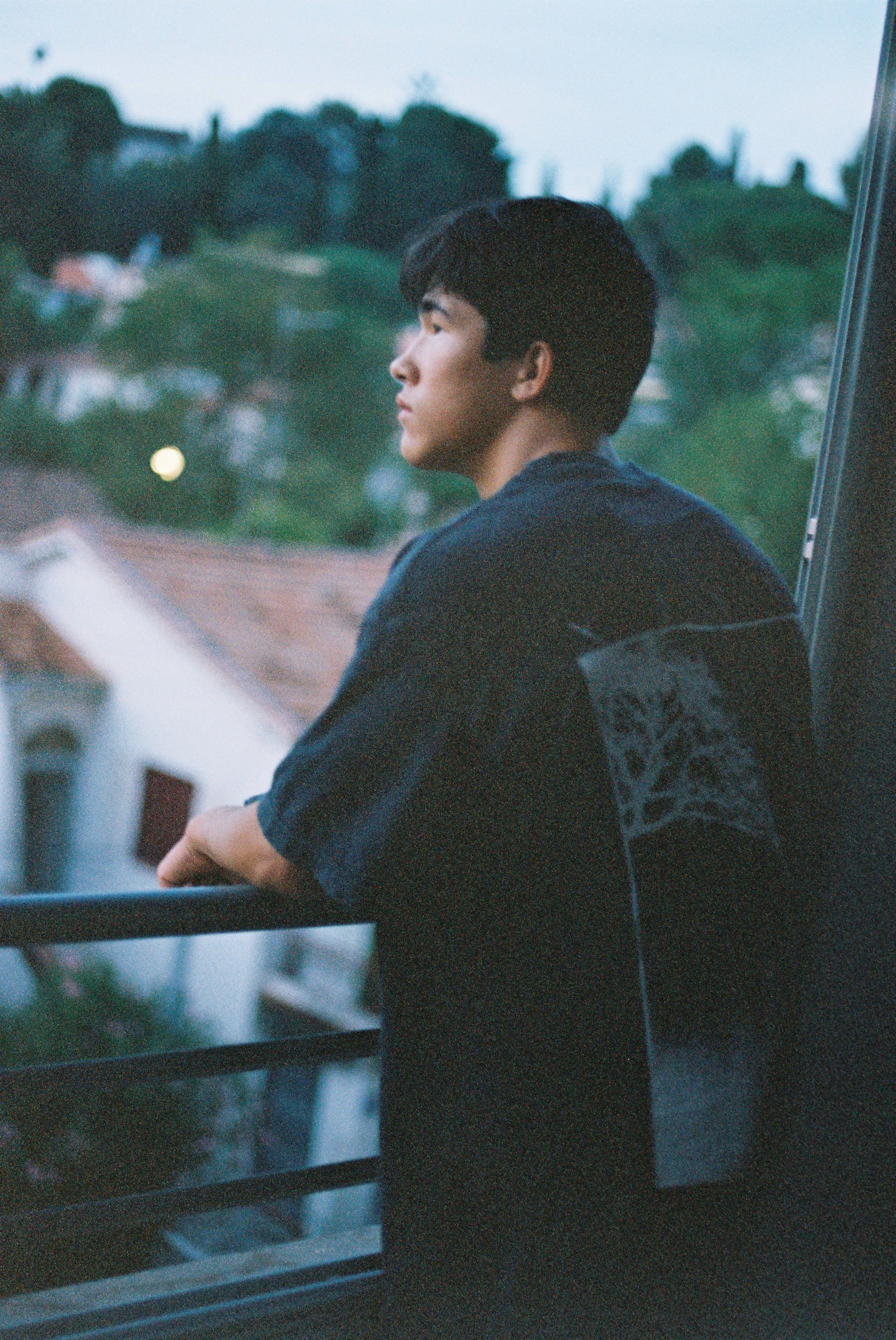
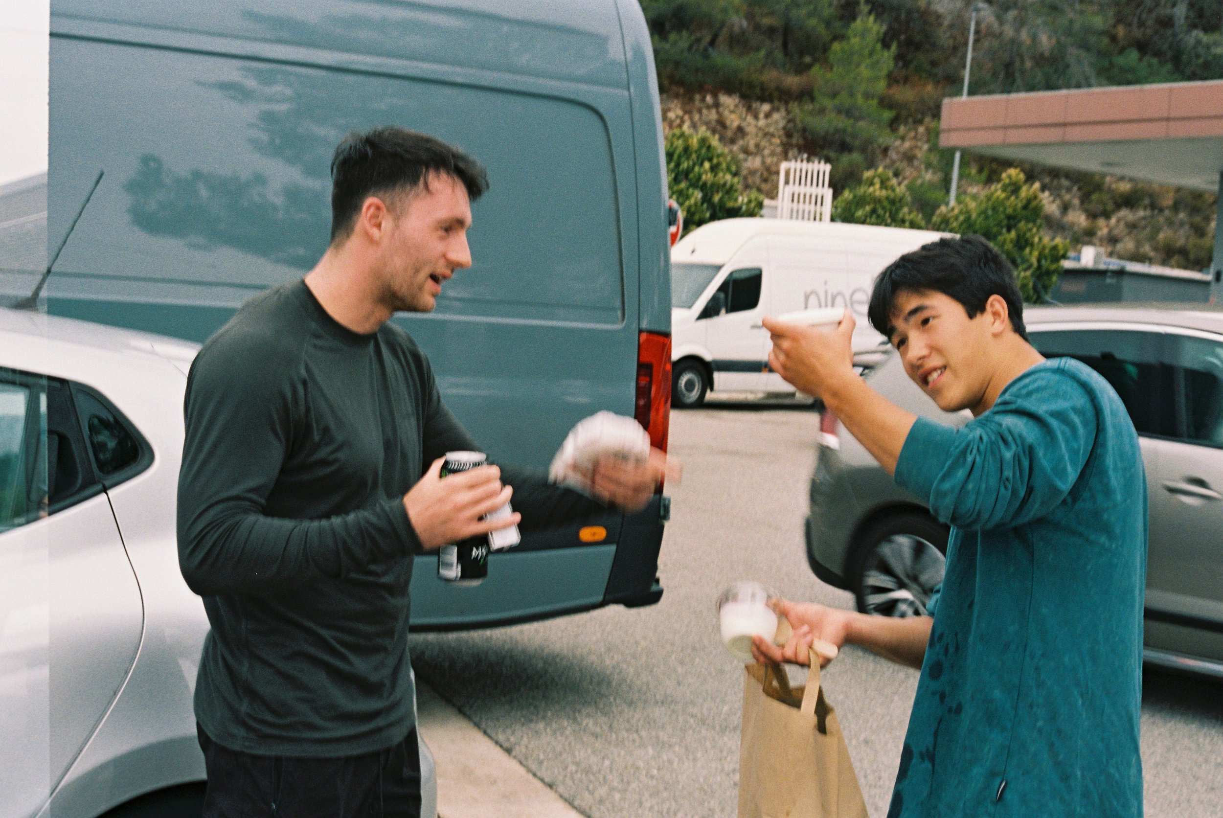
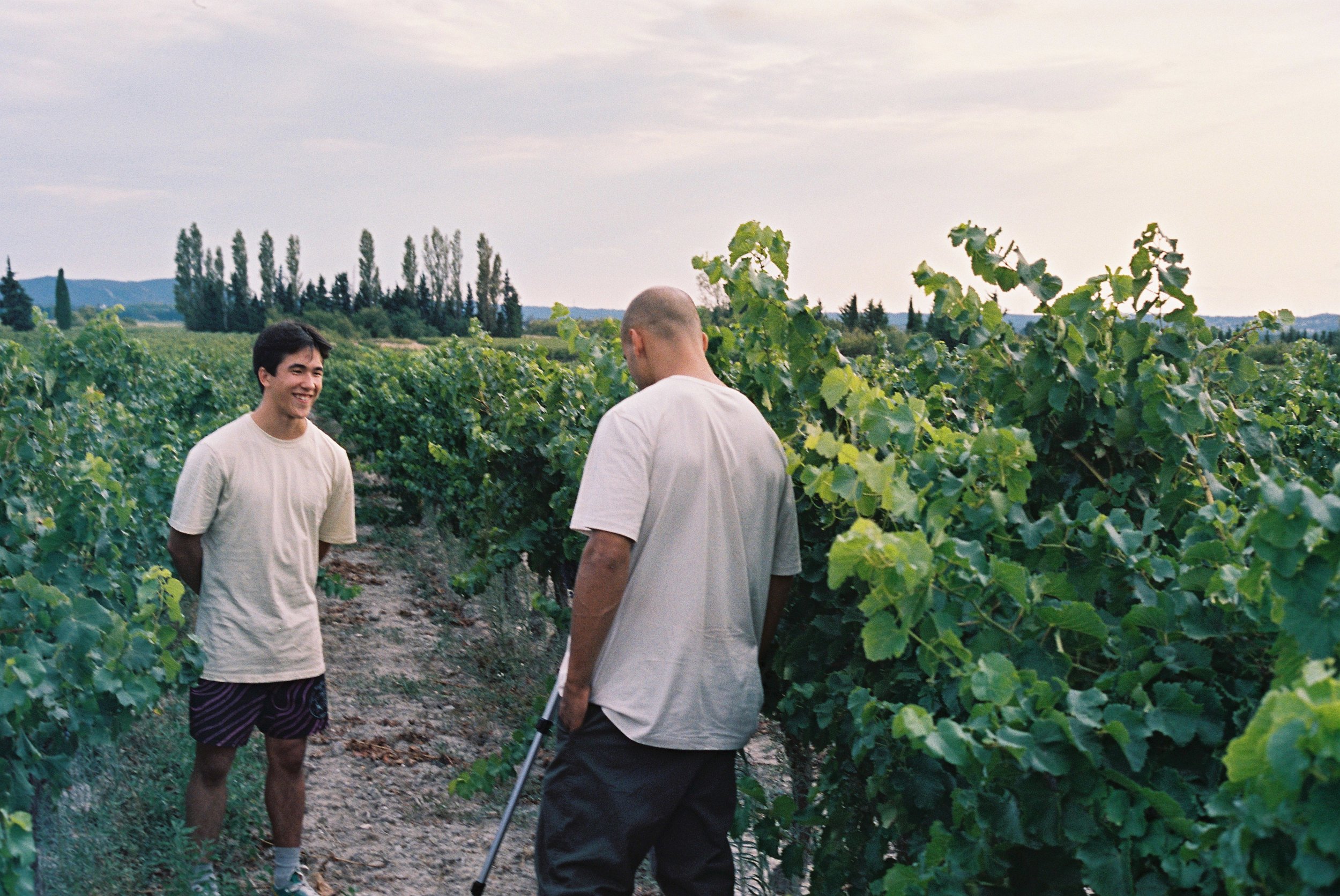
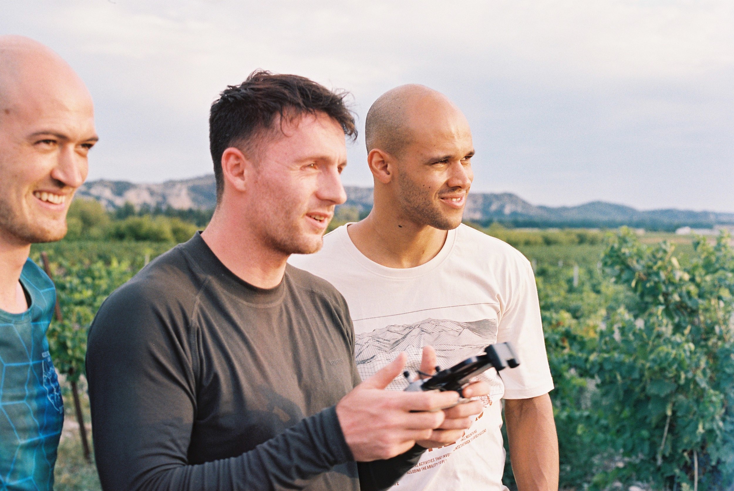
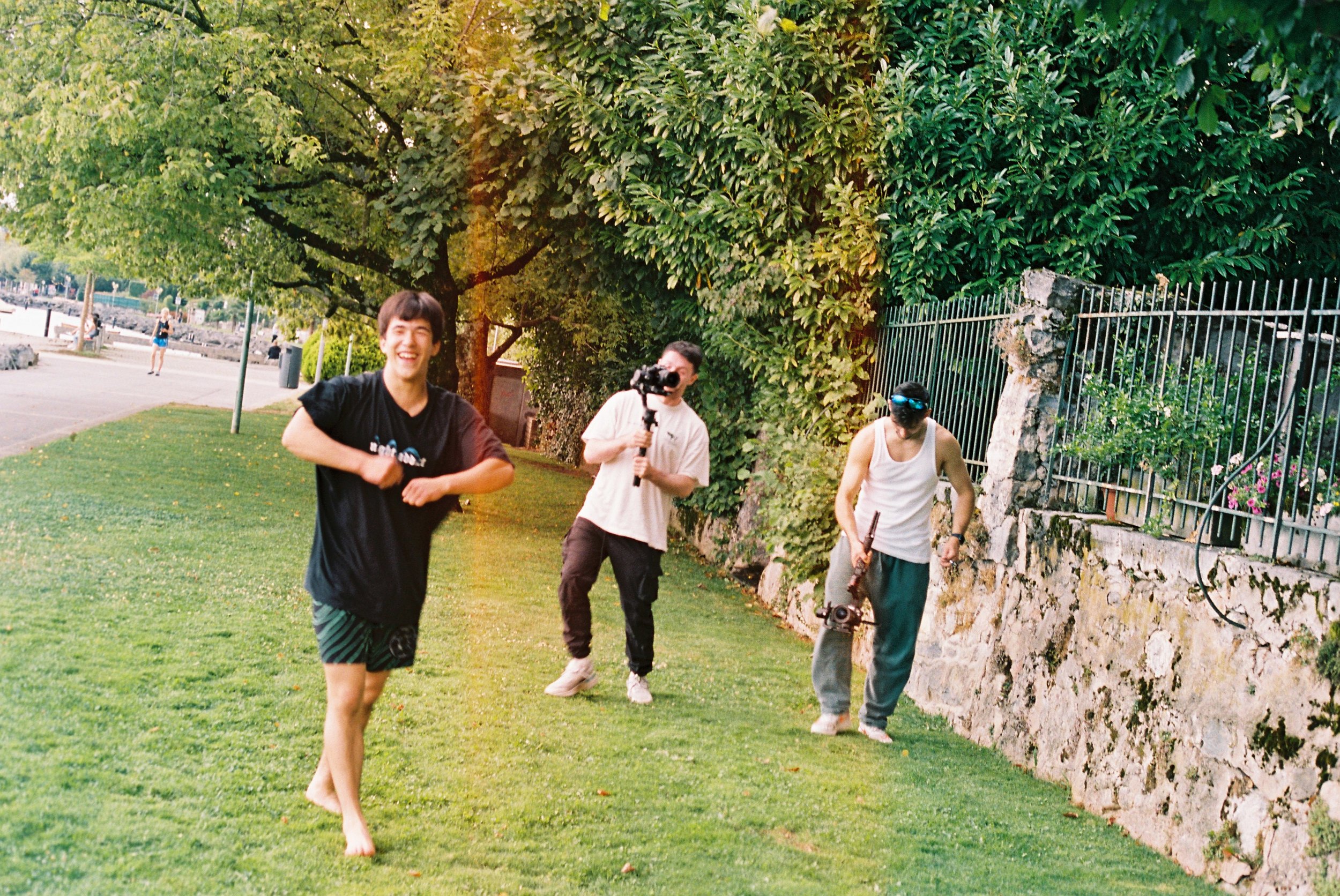
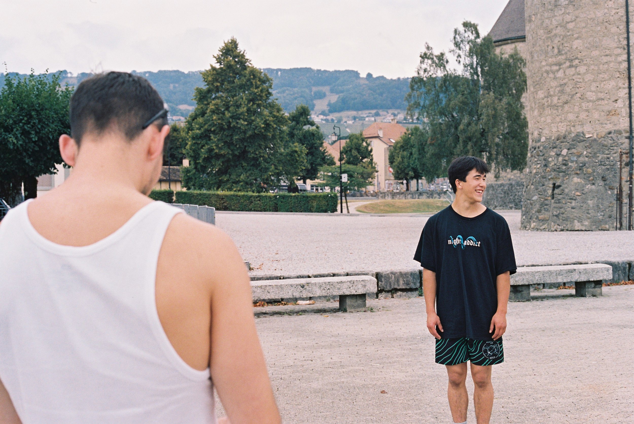
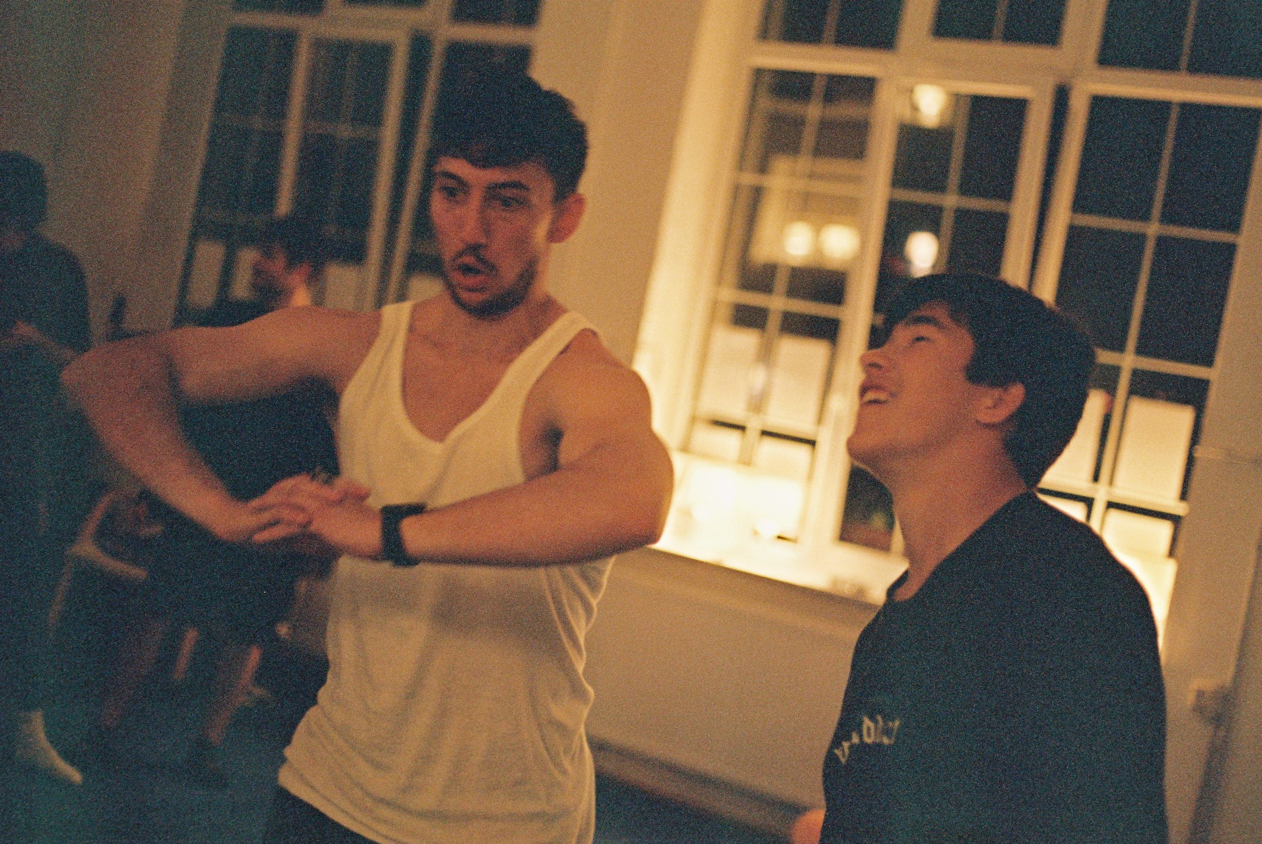
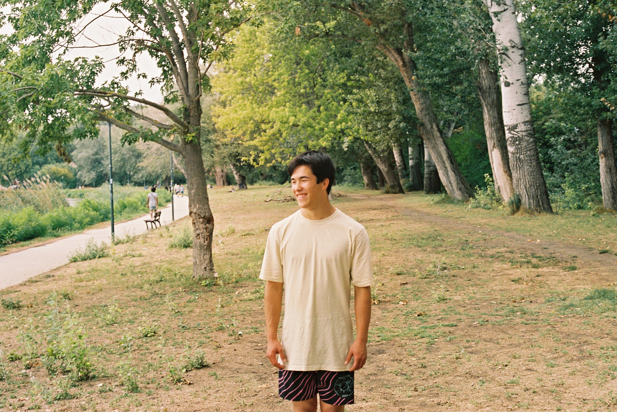
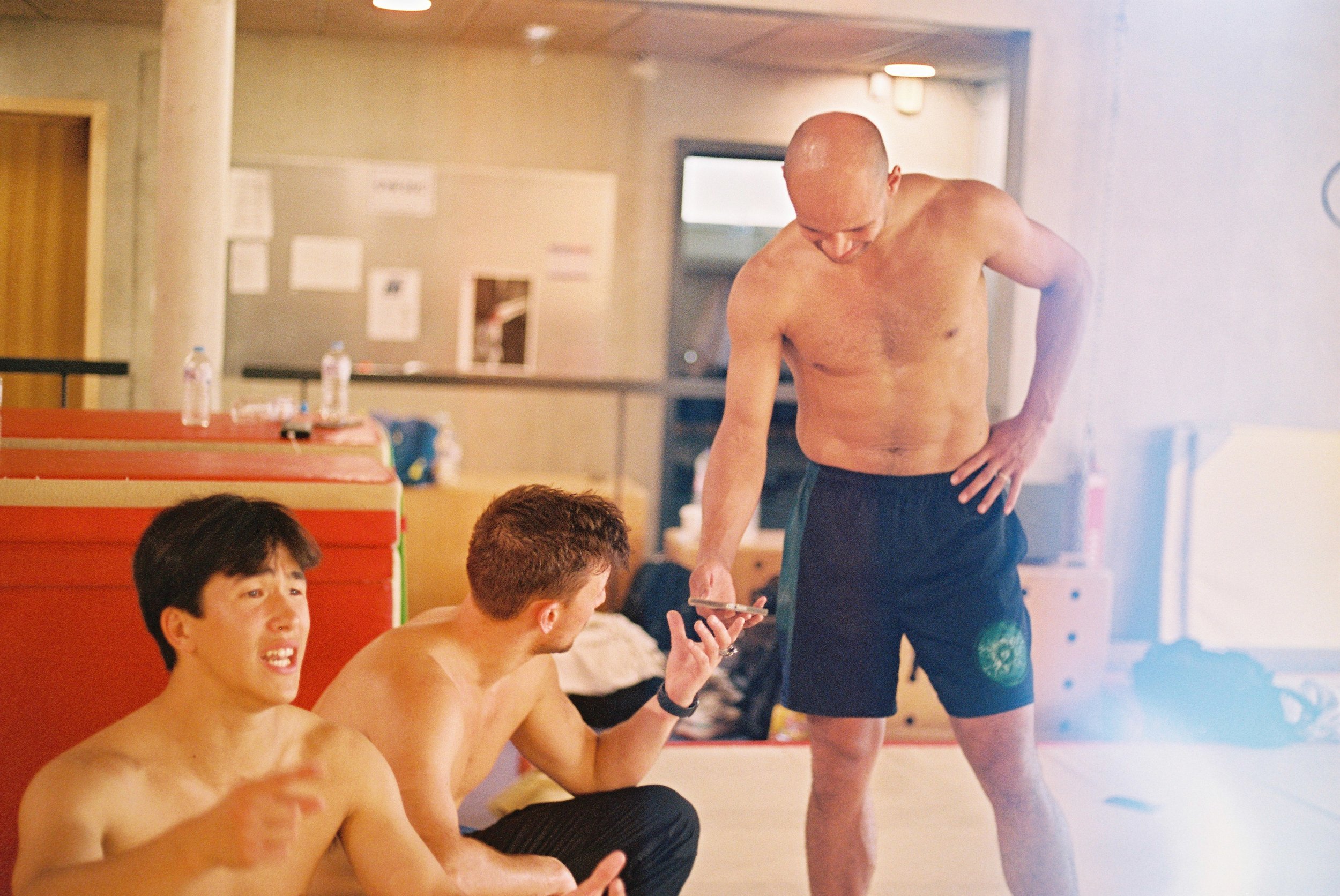
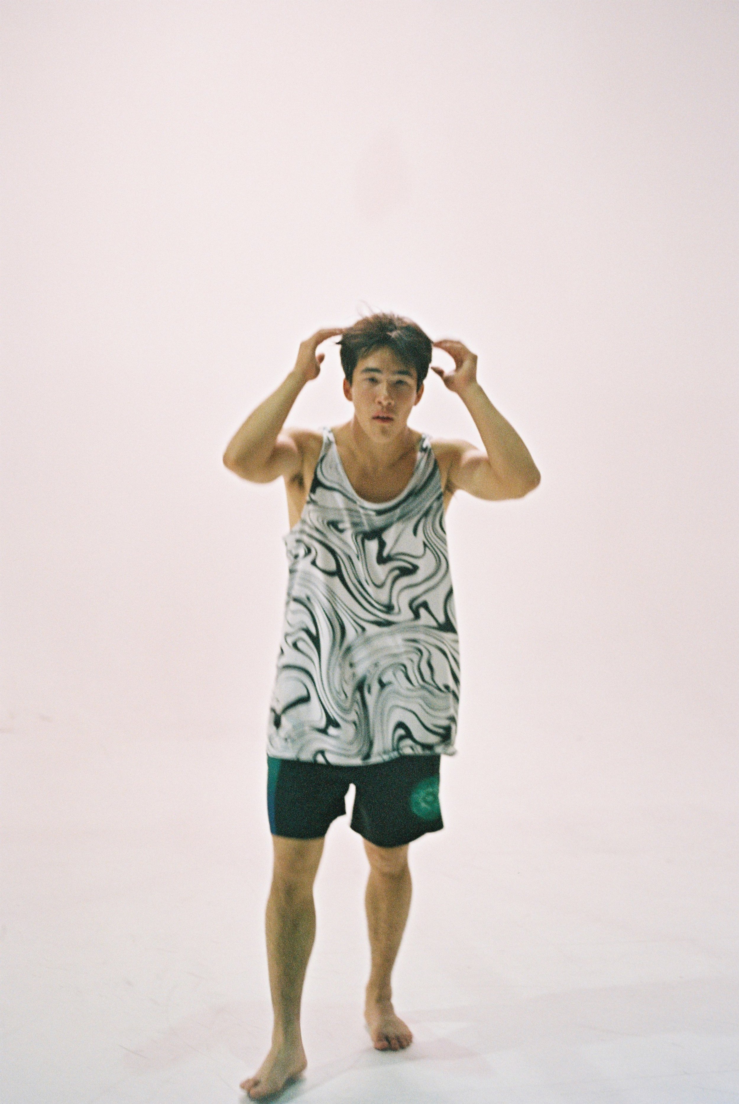
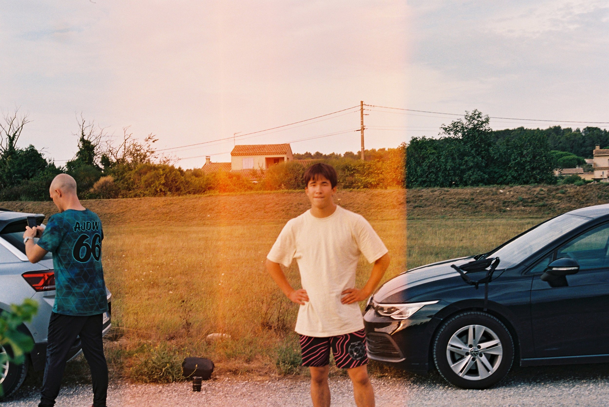
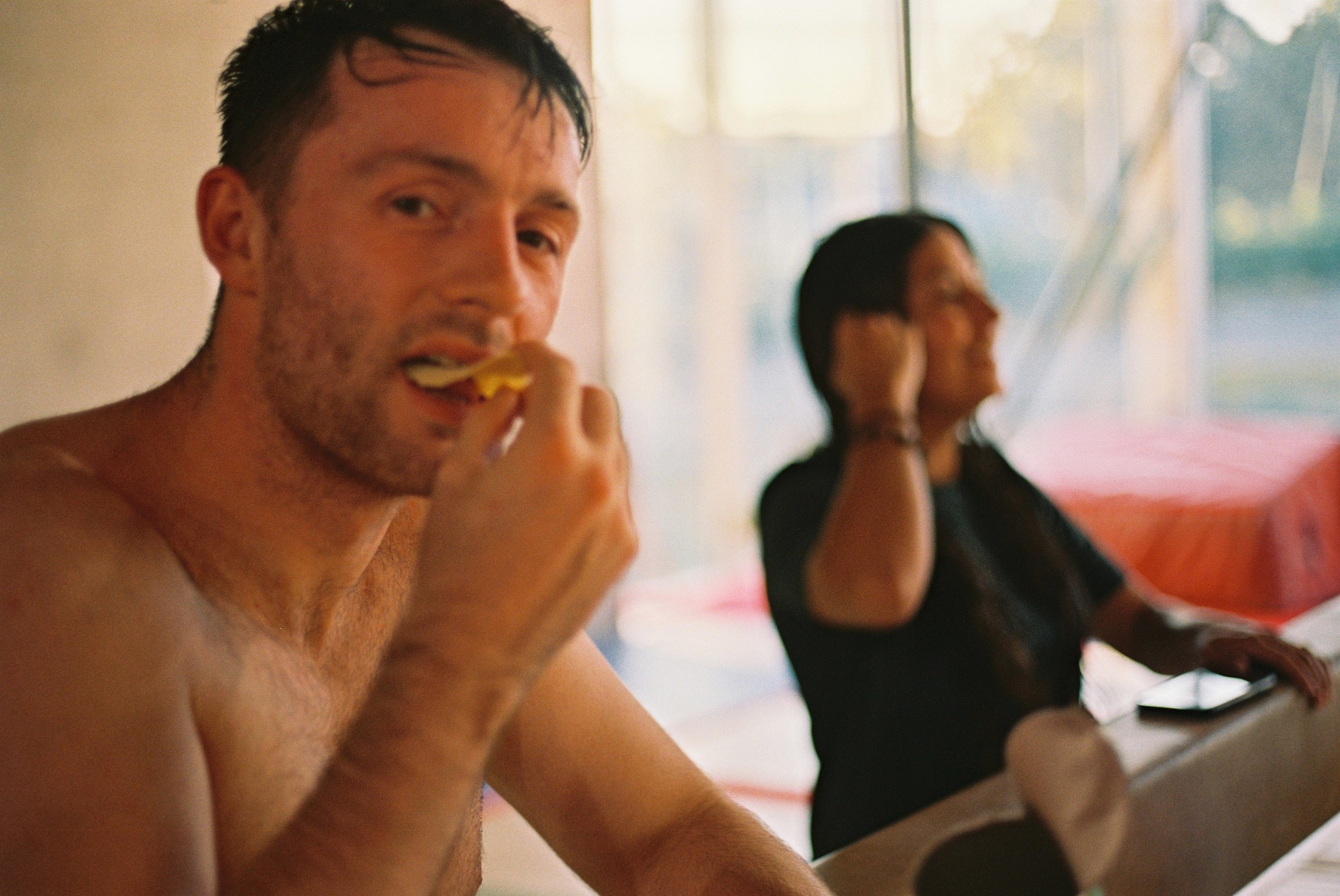
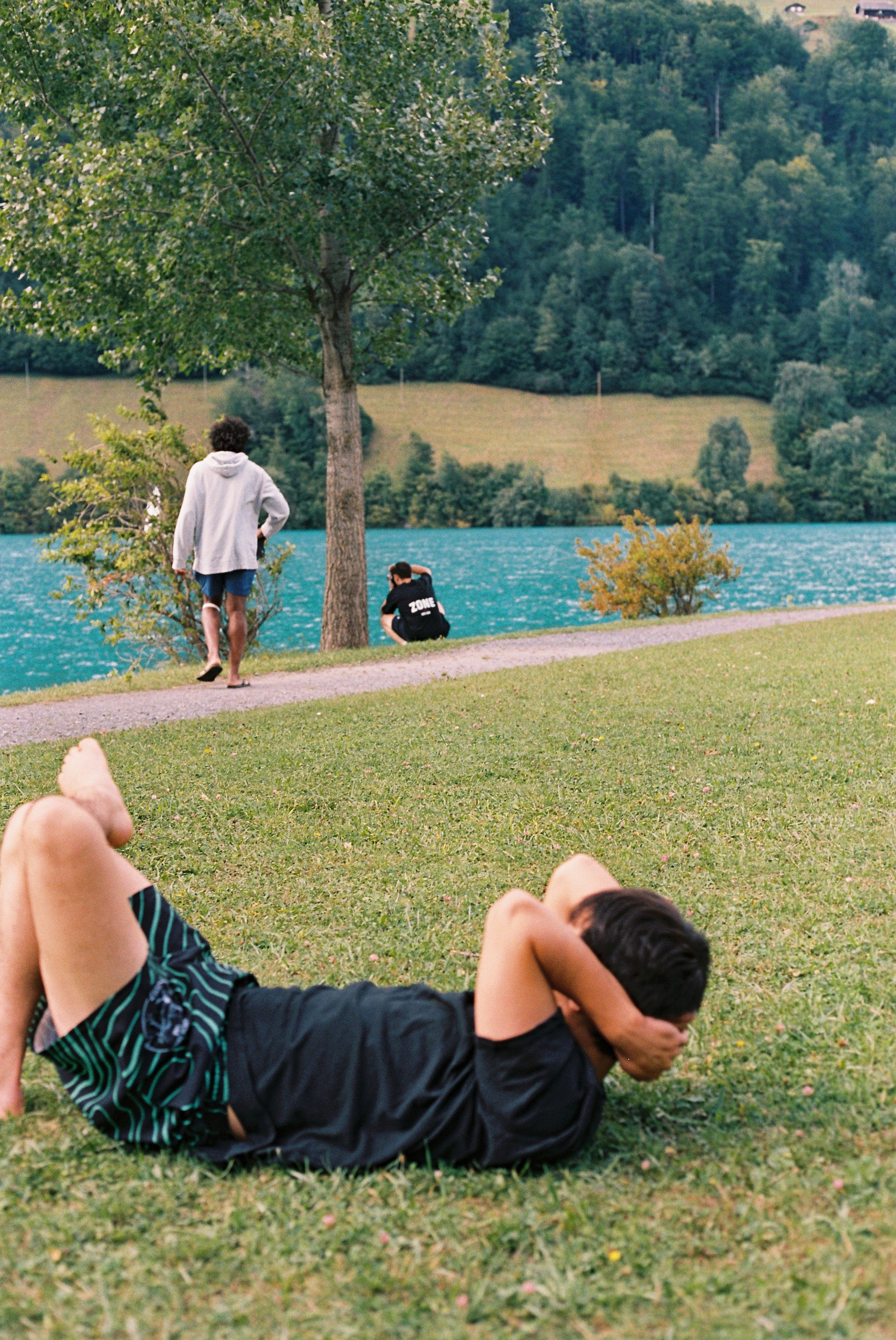
At it's core this was a road trip, and I wanted that classic feeling to come through. I tried to achieve that with candid 35mm photos throughout the movie to fill in those little moments that didn't get filmed, of a group of friends out in the world on an adventure. There's also something about actual film that just captures a moment differently to digital that I absolutely love. Something about it feels more tangible in the way it processes the information it takes in, also the fact that you choose when to capture moments more selectively and maybe less perfectly because of the limited nature of exposures in a film roll. I wanted to get a piece of that magic into the movie.
3D
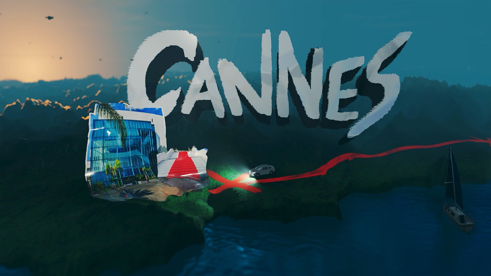
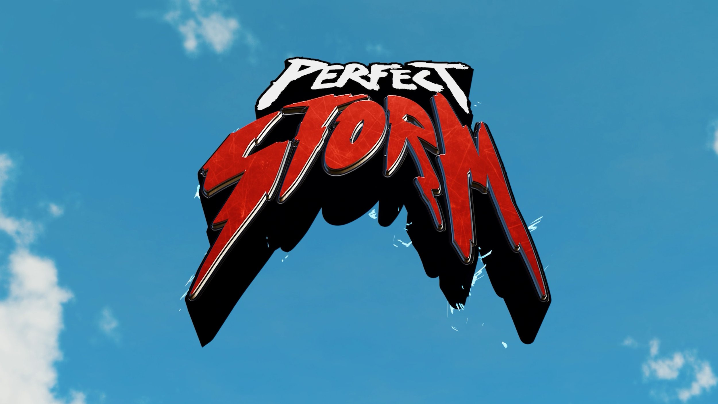
CGI was going to be one of the big tools at my disposal to really bring some pizaz to the movie and go beyond what was possible with live action or even the photo collage. 3D was used to build our dynamic world map that logged our travel across Europe as well as bring to life a bombastic final shot of the opening sequence, a particularly technical visual gag and the final Logo.
Map
The map is a classic roadtrip item but also crucial in helping orientate the audience to where we are. This could have been done simply with 2d but I wanted to bring a grander sense of scale than that. 3d let us do big dynamic camera moves and really bring a sense of the scale of our journey. We were also able to make use of various simulation systems to great effect.
I worked on the map in collaboration with a great artist Tom Paxton. He took charge of building the map, lighting, designing the camera shots and fluid simulation systems under my art direction. There was a great deal of exploration and back and forth in the beginning to land on a look that felt clear enough to quickly give the audience the information they needed and coherent enough with the existing style to fit the aesthetic of the film.
The map was also used as a vehicle to give not just geographical information but time and weather information. For the first day of the trip Tom built a great shot where the sun sets and the car lights turn on as we reach our last location of the day as we had gone from day to night between our previous location and reaching our last one. It leads us instinctively into the night footage while being an awesome dynamic shot.
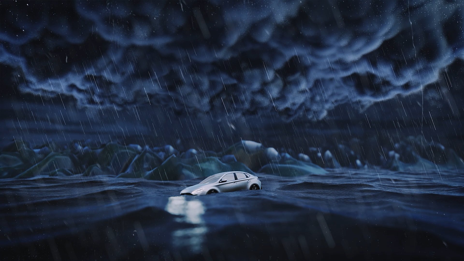
On the next day we have big trouble with a thunder storm and our plans for our next location are ruined, we can't go anywhere and rather than the map showing our next move it floods with water and the car floats up, powerless to the storm.
Logo
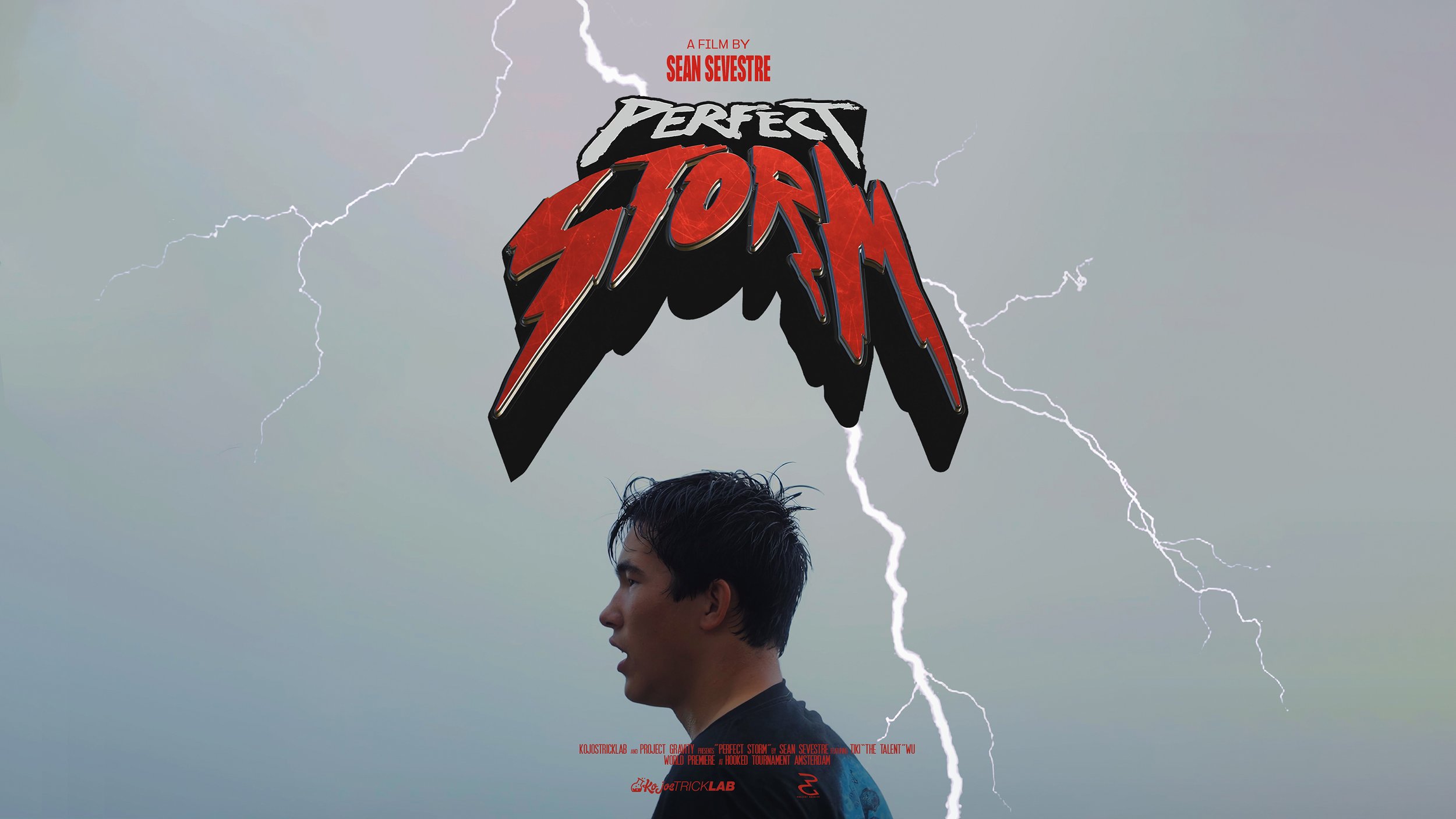
I love logo and font design even though it’s not something I do regularly and I was really looking forward to trying design a logo for this project that would give it real character and identity.
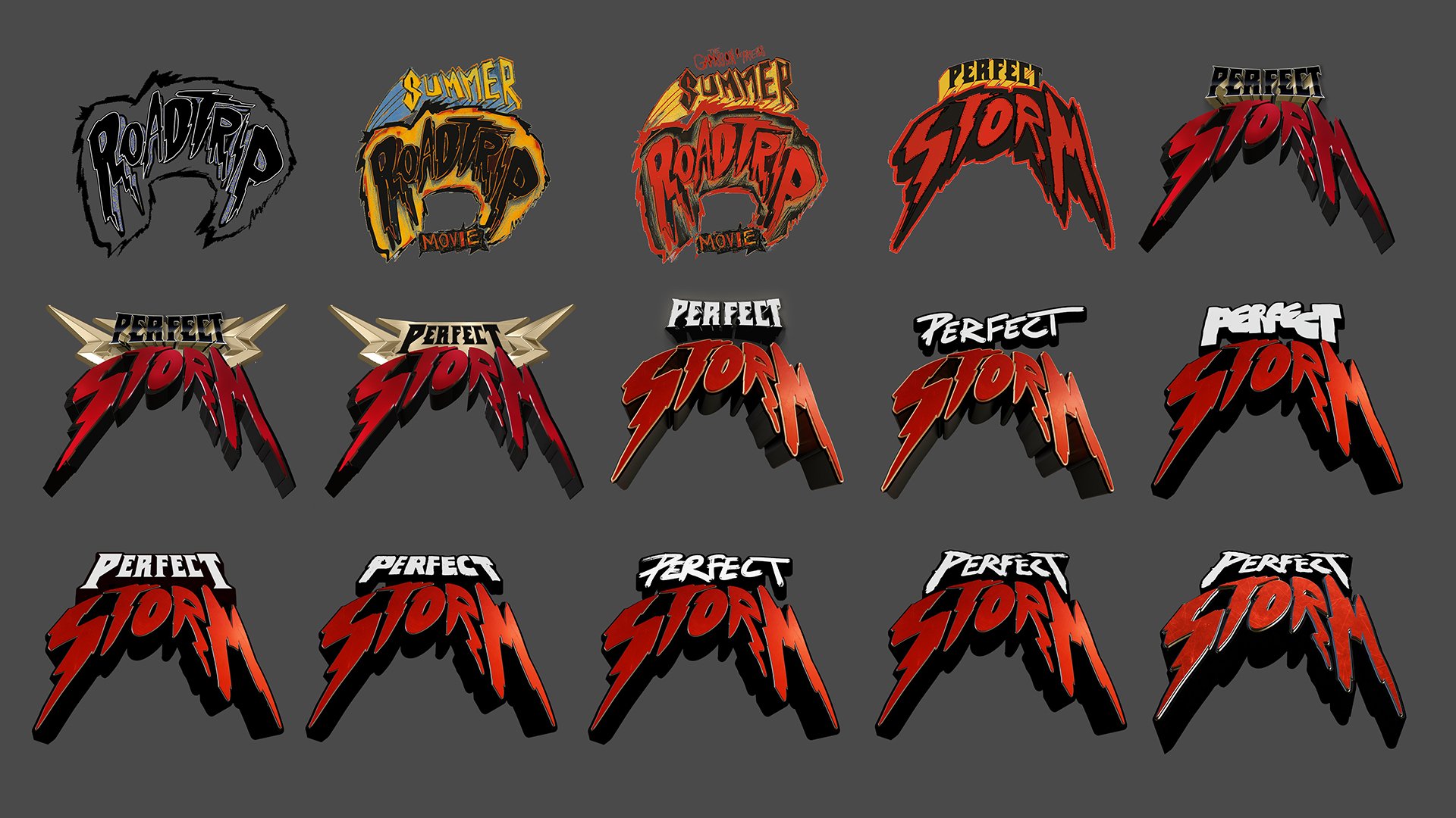
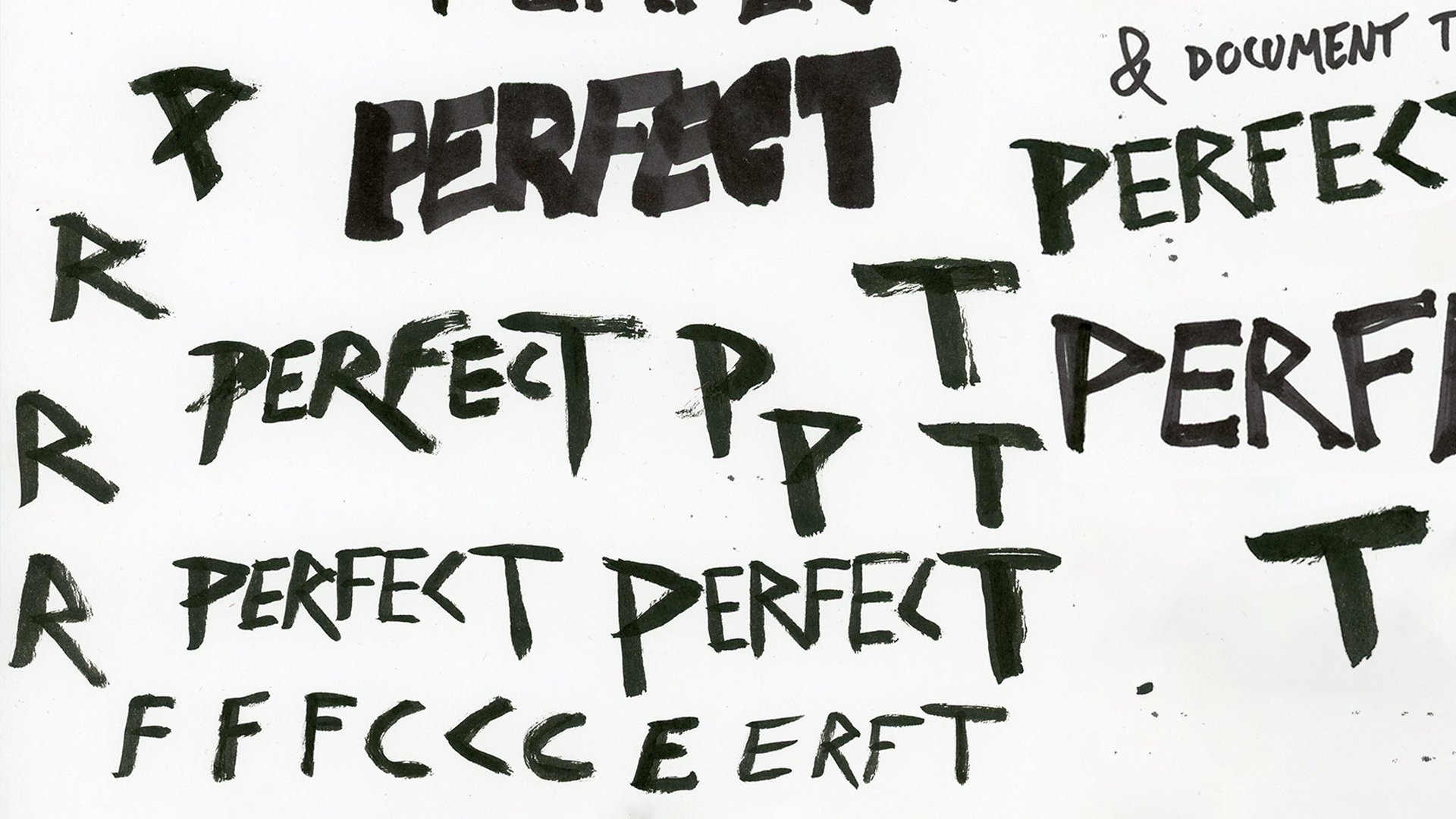
The logo, and even the name of the project took a long time to fall in to place. I had a placeholder name and logo that I made on the first day of hearing about the project that remained in place until after I had a full rough draft. Once we landed on Perfect Storm as a name I started properly exploring ideas. I had a vision of something meaty and substantial, chunky, 3d and in your face! It had to embody the tone of the trip and the movie so that at a glance you had an idea of what you were in store for. Getting to a ball park visual wasn't too hard but fine tuning it to feel just right took many iterations. I must have 20+ different versions of "PERFECT" and combinations of versions and hand written specific letters with different types of pen to try and get the write shape, texture and overall flow to the logo. Once that finally felt right I converted my 2d photoshop logo to a vector so I could take it into 3d. There I was able to give it the finishing chunkiness and materials that gave it the feeling I was looking for.
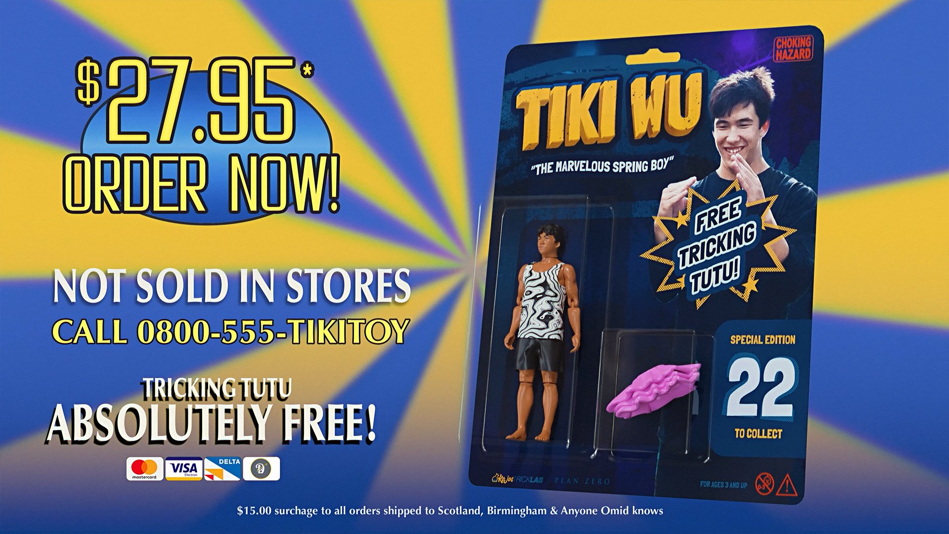
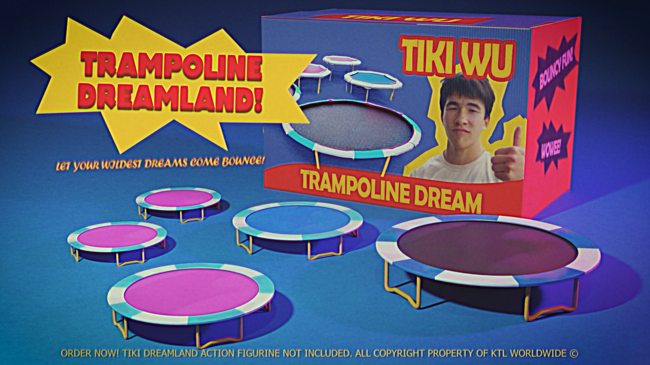
Tiki Toys
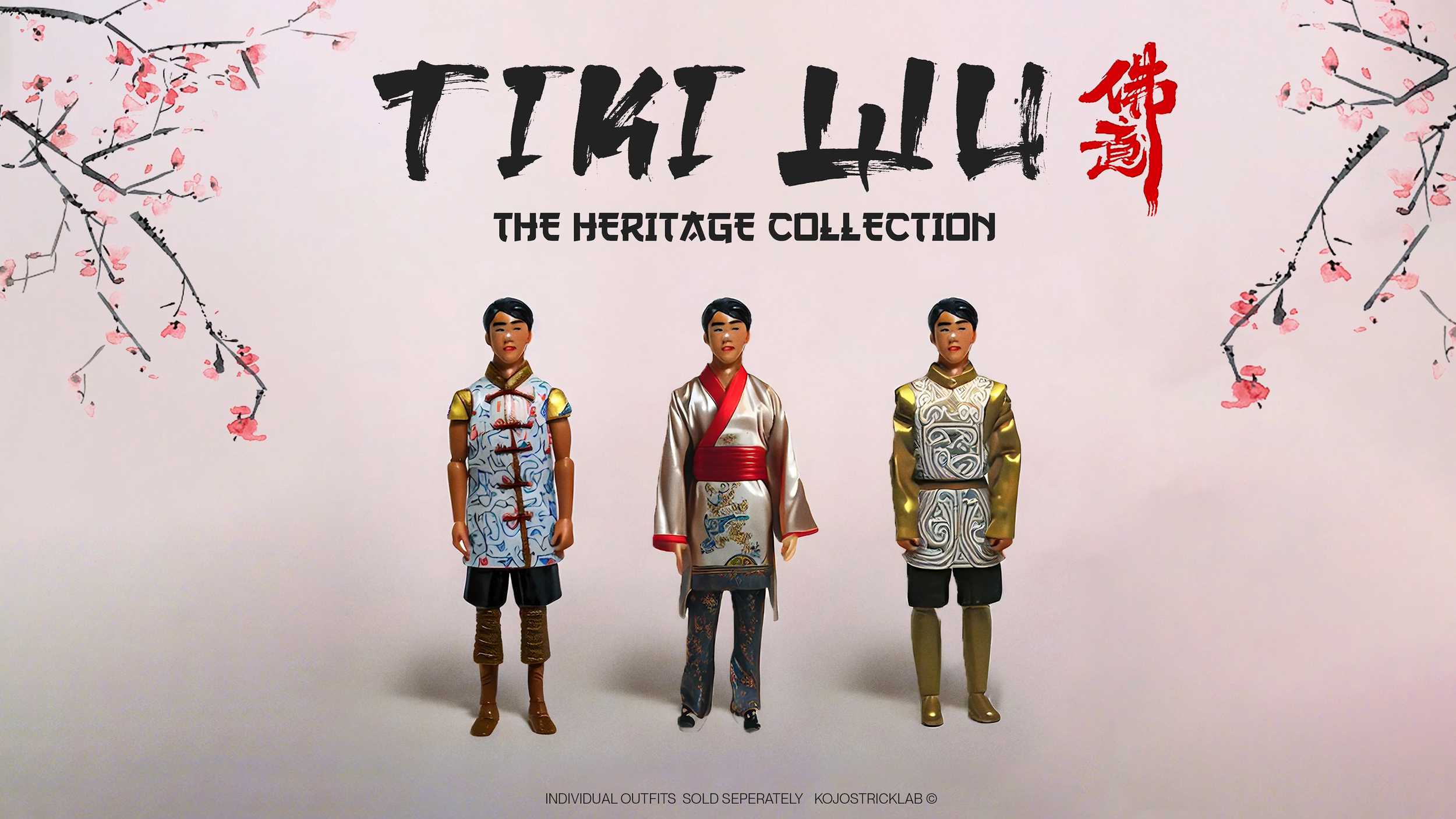
Have you ever wondered what you’d look like as an action figure? Well I took it upon myself to answer this question nobody asked for Tiki Wu through a process I am coining the Reverse Pinocchio, turning a real boy into a toy.
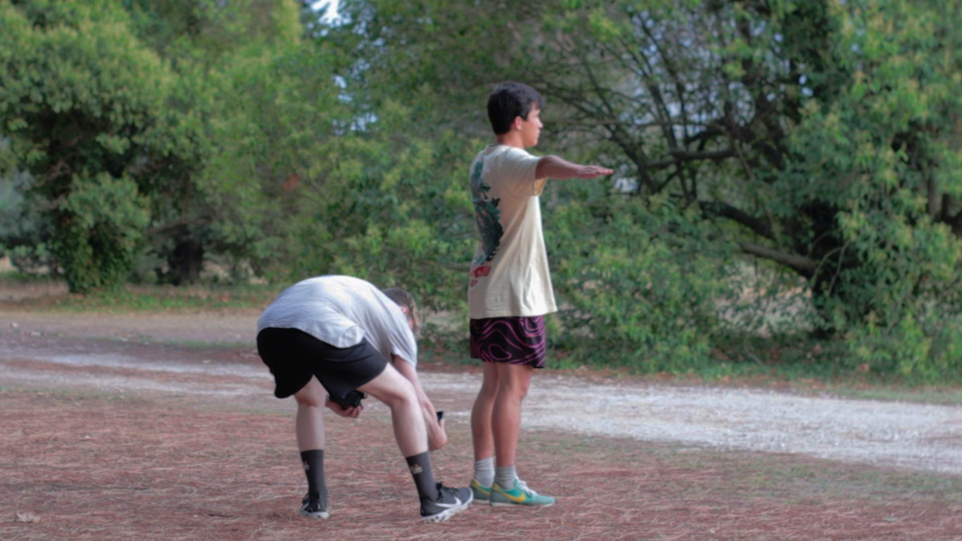
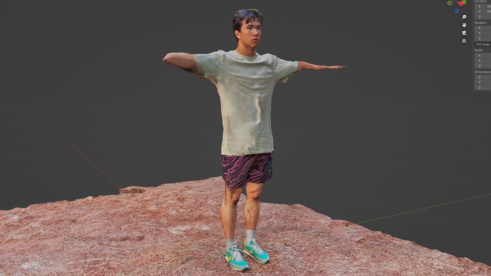
As soon as this joke was made on the trip I knew I wanted to bring it to life. To what extent I'd be able to though I had no idea. I made several 3d scans across the trip as I thought they could be great assets to work with in the edit. One evening I got a scan of Tiki that ended up being really useful for this build.
The scan was far from perfect but it had captured Tiki facial geometry and likeness well and that’s all I would need from the scan. I subdivided the head to get more resolution into the features and smoothed out any glitchy bits that left me with a base likeness to create an epic Tiki Toy.
Once I had the head I found a free 3d print ready stock figurine that was a great base to work the rest of the body up from. I got rid of the head and the original body had quite super hero-esque proportions so I adjusted them to feel more representative of Tiki, shrinking mainly the arm and shoulder size and adding more to the traps as Tiki is a thick neck boy.
I wanted to build this up in a way that mimicked the process of a real toy to get it to look right. I split Tiki’s hair into it’s own lego leg piece so it could sit with a much harder edge on top of his head and gave everything the same unified plastic material. I hand painted Tiki’s eyes and lips which gave it just the right amount of imperfection to feel like genuine and small and finnicky. Lastly I added and outfit that mirrored Tiki’s and built textures like the ones of his real clothes. And just like that the Tiki Toy had become reality!
Of course it couldn’t stop there, we need a world of Tiki Toys! A whole franchise! He’s gonna be a star this kid! I created several Tiki products with their own methods of creation and branding. This bit is probably around five seconds of screen time in the movie but I absolutely loved making it all and it’s one of my favourite jokes in the film.
Hope you enjoyed the breakdown of some of the creative side of the production. If you haven’t checked out the documentary yet I cannot help you, you clearly hate fun. To the rest of you thanks for watching! This is a fully independent production paid for and brought to life by a small group of very passionate and skilled people and all your support is greatly appreciated.
If you want to learn more about Tricking you can check out my other documentary BIG, some of the mini docs on my youtube channel or visit Kojo’s Trick Lab where you can start learning yourself!

